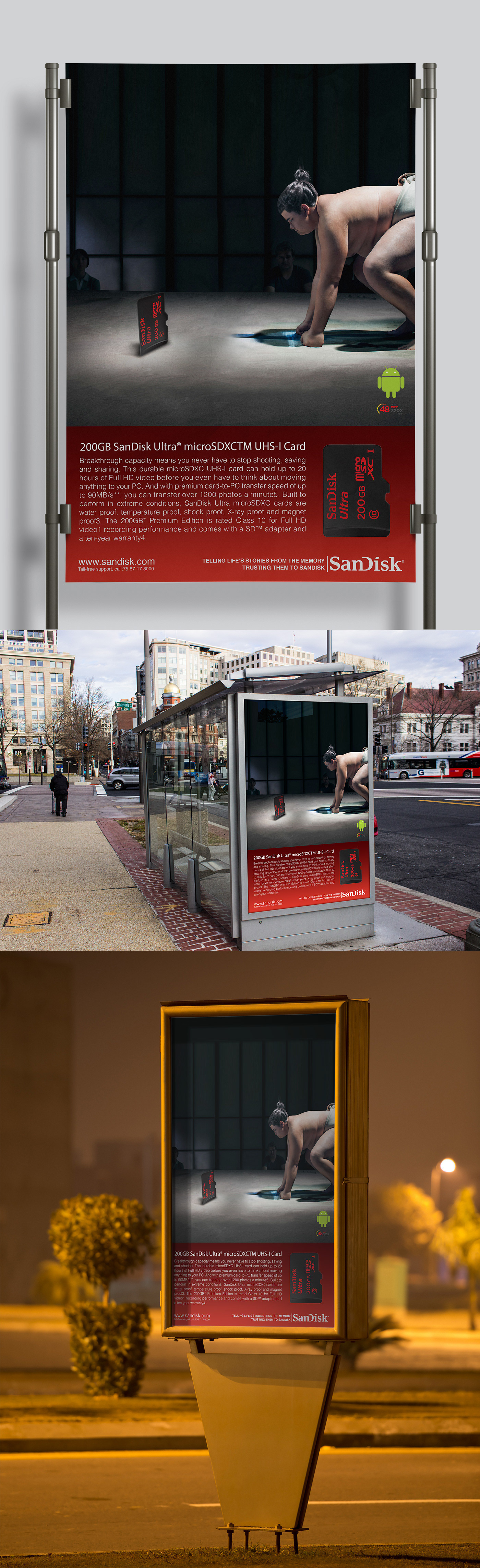
A poster concept for the SanDisk Ultra microSDXC card at 200GB, built on a single confrontation.
Capacity is the hardest thing in consumer tech to make anyone feel. Gigabytes are an abstraction, and the usual answer is to convert them into hours and photo counts, which is information rather than an idea. So the poster does not try to describe how big 200GB is. It stages a fight.
A sumo wrestler sets himself in the crouch on the dohyo, the moment before the charge, and across the ring from him stands the card. Sumo is the sport where mass is the whole argument, which makes the rikishi the most efficient shorthand for heavyweight that exists. Putting a thumbnail sized piece of plastic opposite him is the entire message: this is the challenger, and it is not conceding anything on size.
The lighting does the rest. The hall is kept dark and the card is lit from below so it throws a shadow across the clay in the wrestler's own direction, which is how something small is given presence in a photograph without faking its scale.
Below the image, a red band carries the product name, the specification and the endline, so the poster reads as a challenge from twenty metres and as a spec sheet from two. Mocked up across roadside six sheets, bus shelters and street furniture, day and night.