
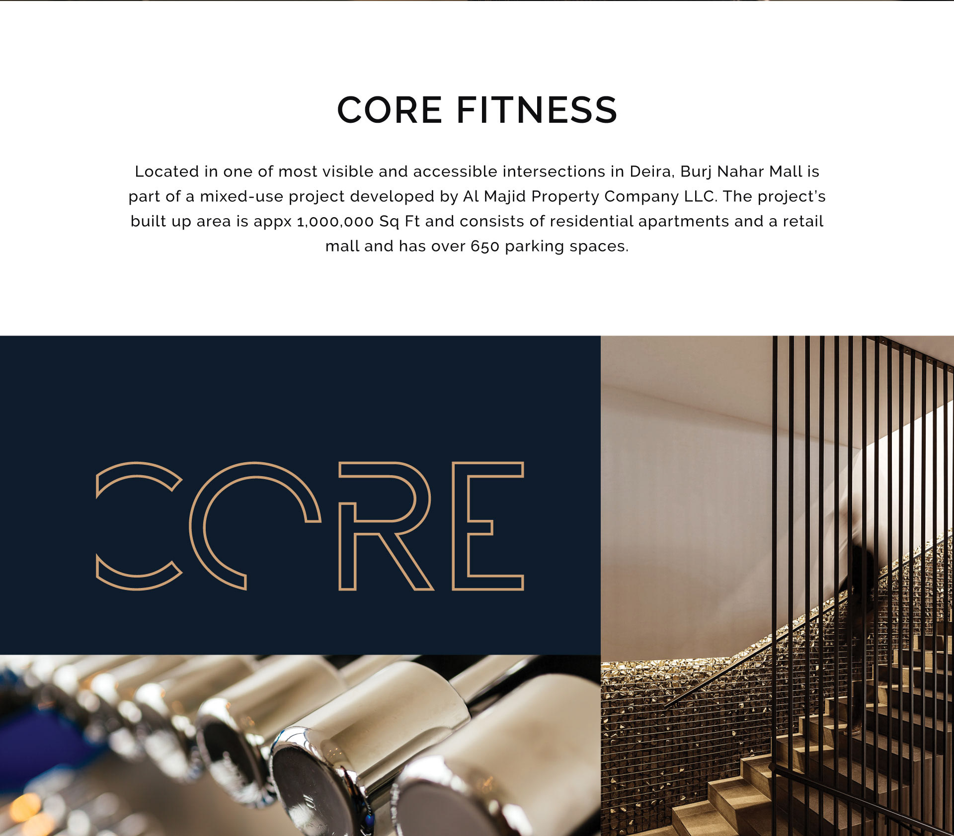


Core Fitness is a luxury gym and wellness club, and the identity is built to look nothing like a gym.
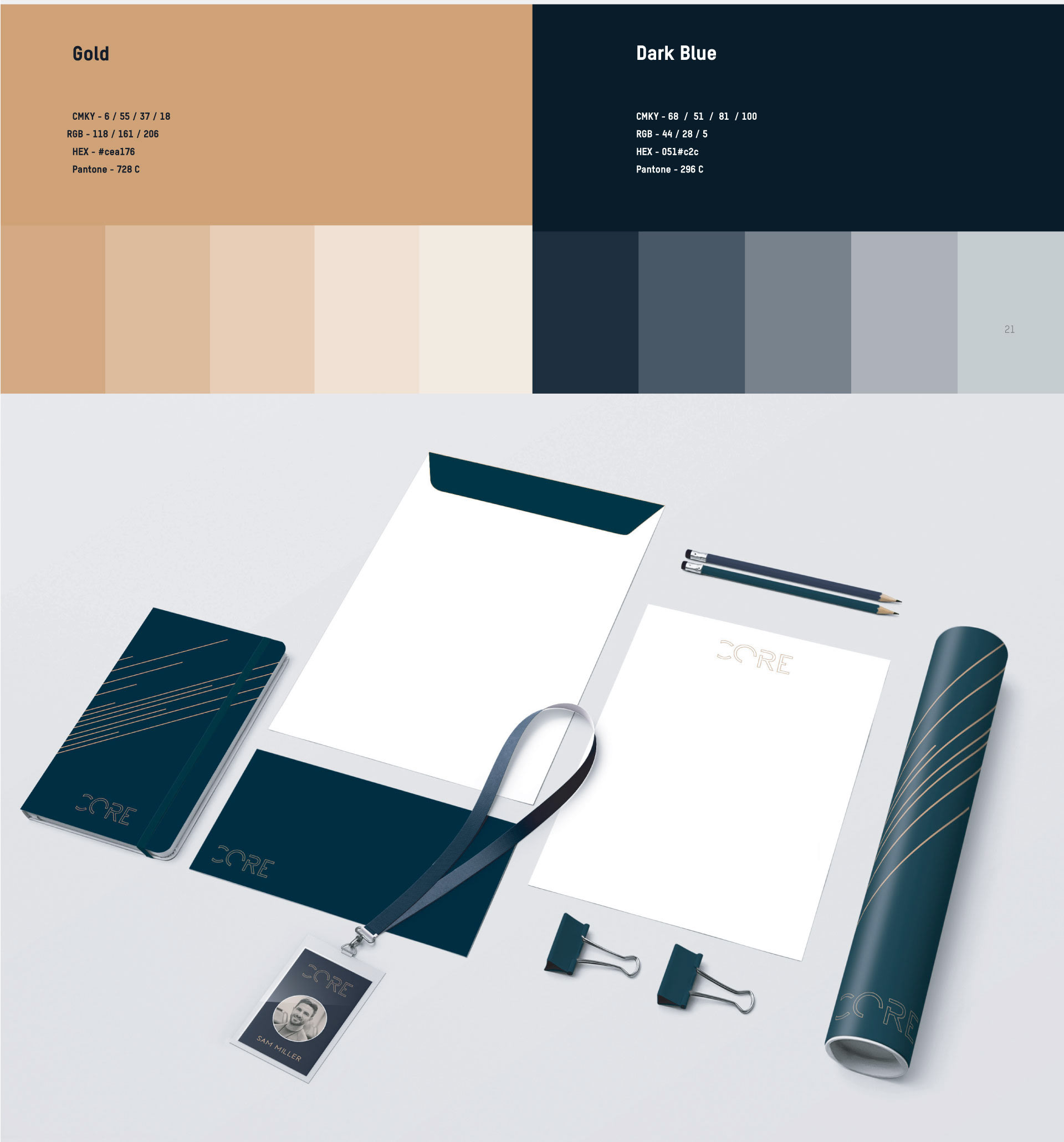
The category default is high contrast and shouting, neon on black. This goes the other way. Deep navy against a warm sand palette, gold foil on dark board, and a fine diagonal line pattern that reads as texture rather than as graphics. It sits closer to a hotel spa than to a fitness chain, which is honest, because the facility runs treatment rooms, a steam room and a pool alongside the floor.
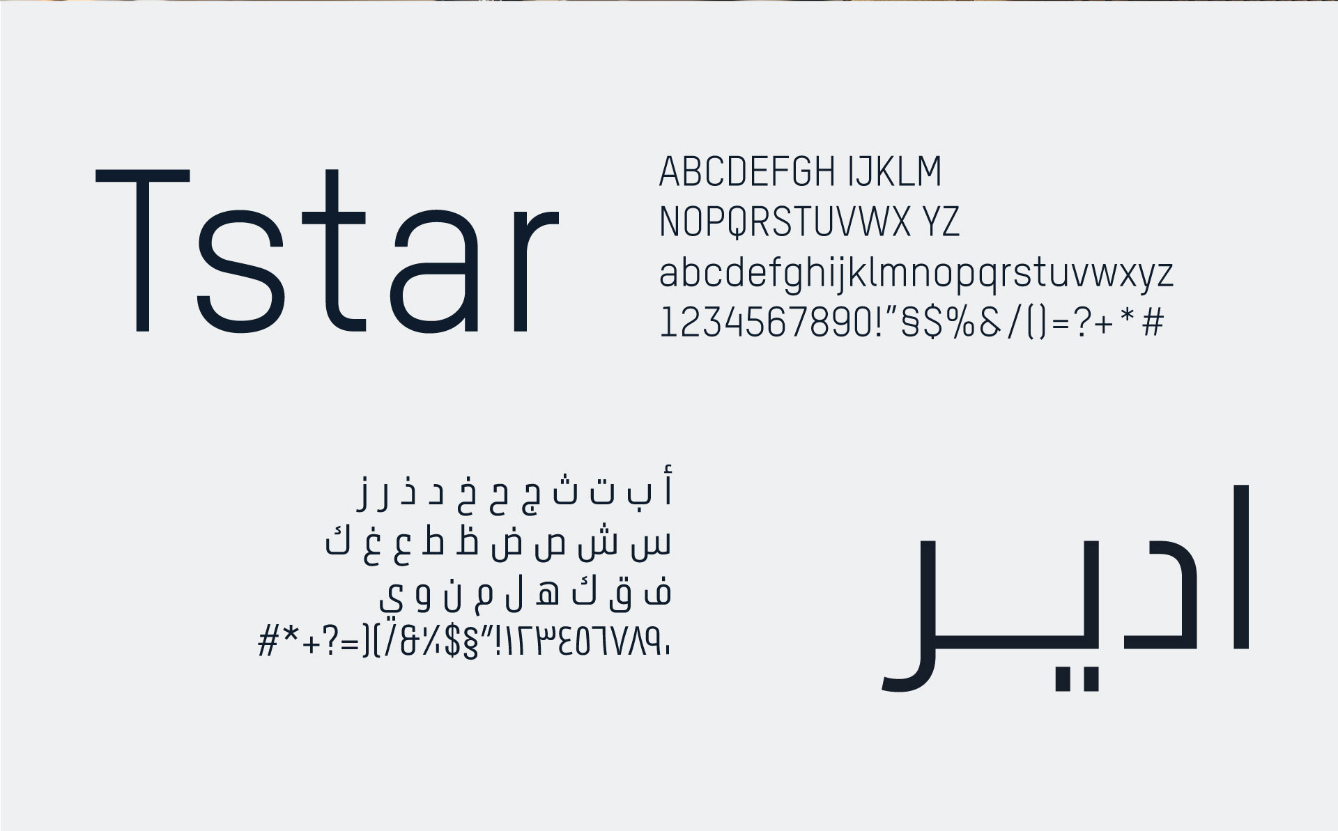
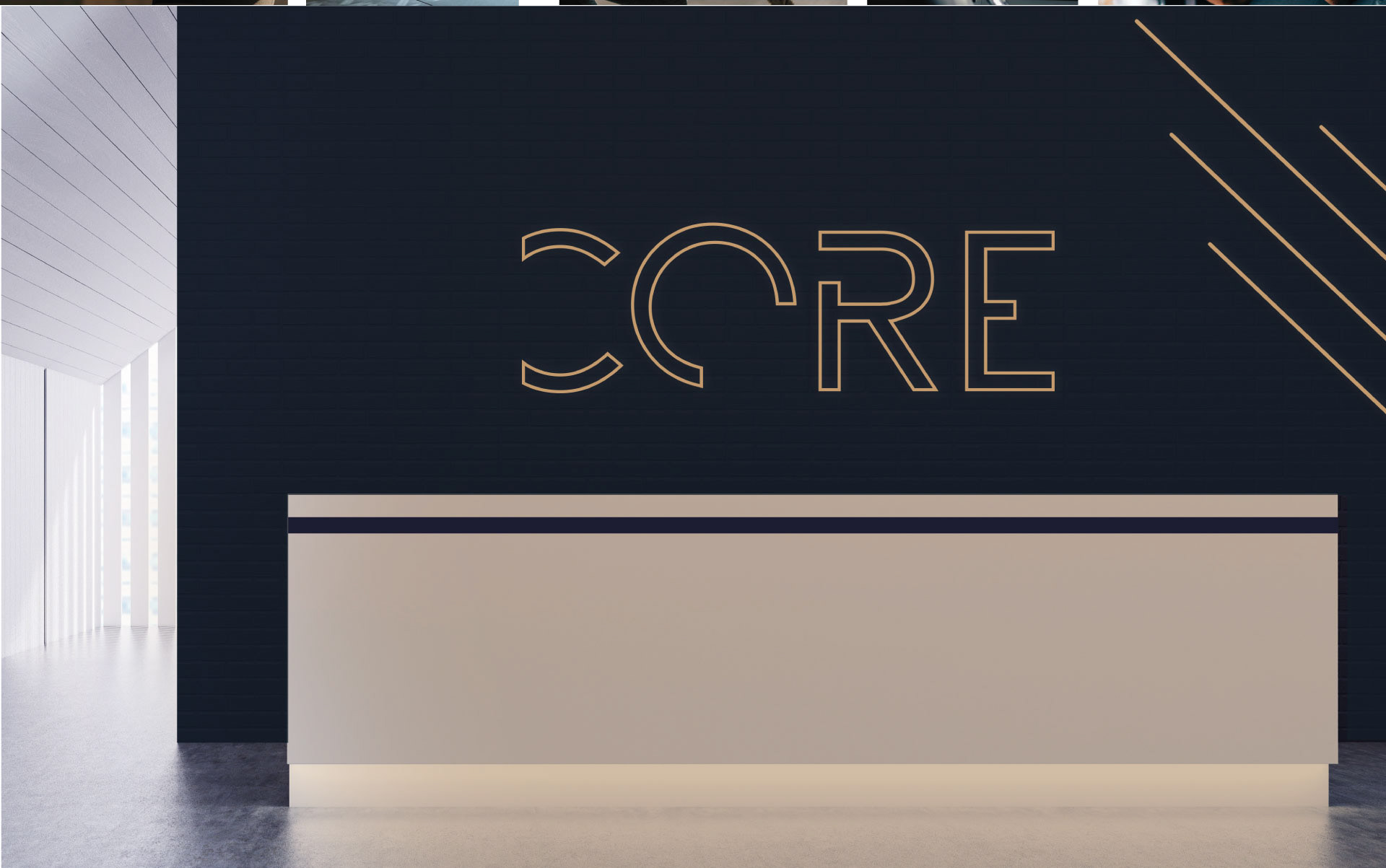
The wordmark is set wide and quiet, with the C drawn as an open form so it holds at embossed card size and at wall size without being redrawn.
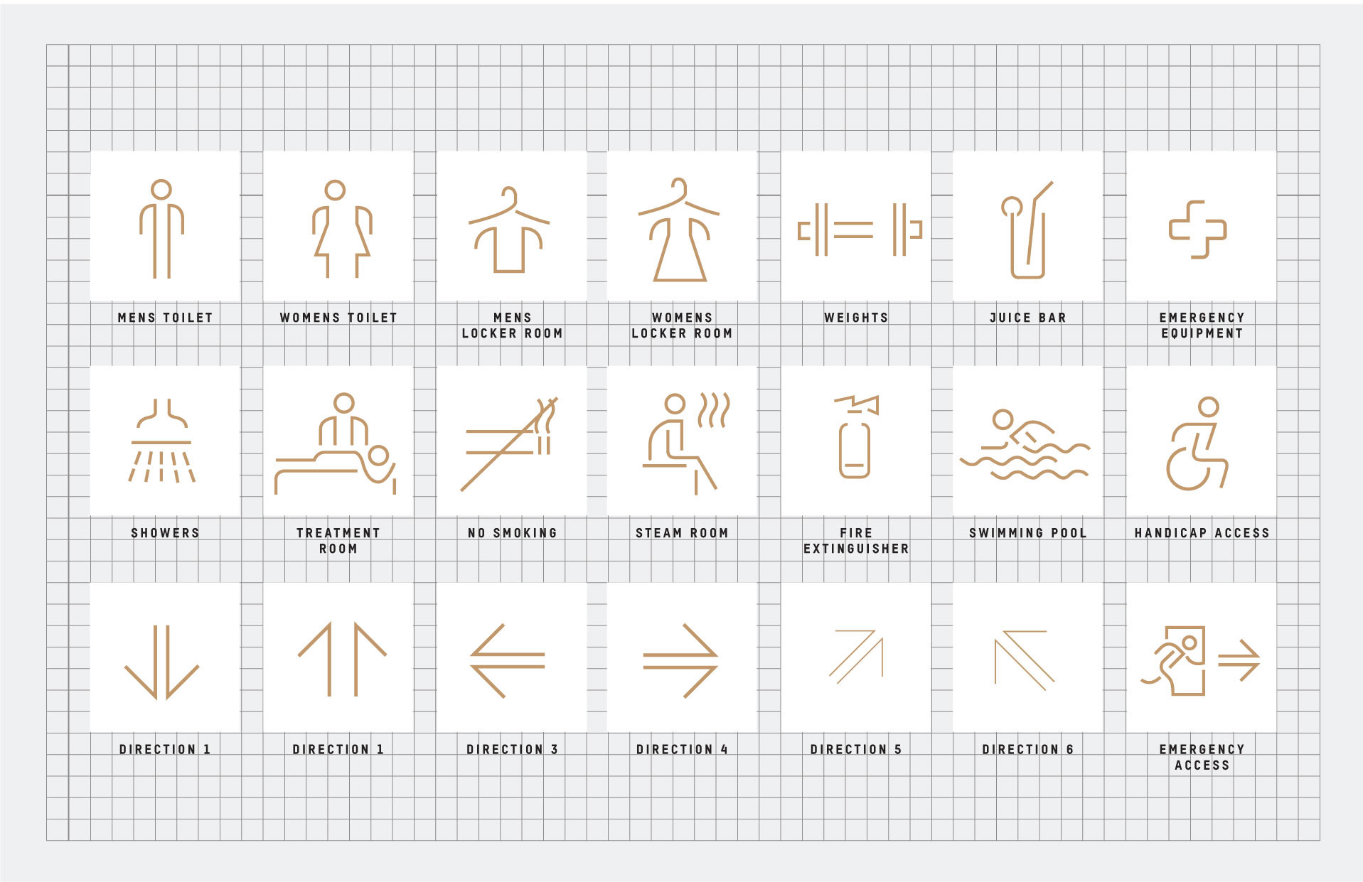
The pictogram set is where the system does its real work. Showers, locker rooms, treatment room, steam room, swimming pool, fire extinguisher, accessible and emergency access, plus a six direction arrow family, all drawn as single weight gold line on a common grid. One line weight, one corner radius, one square. New signs can be added later without breaking the family.
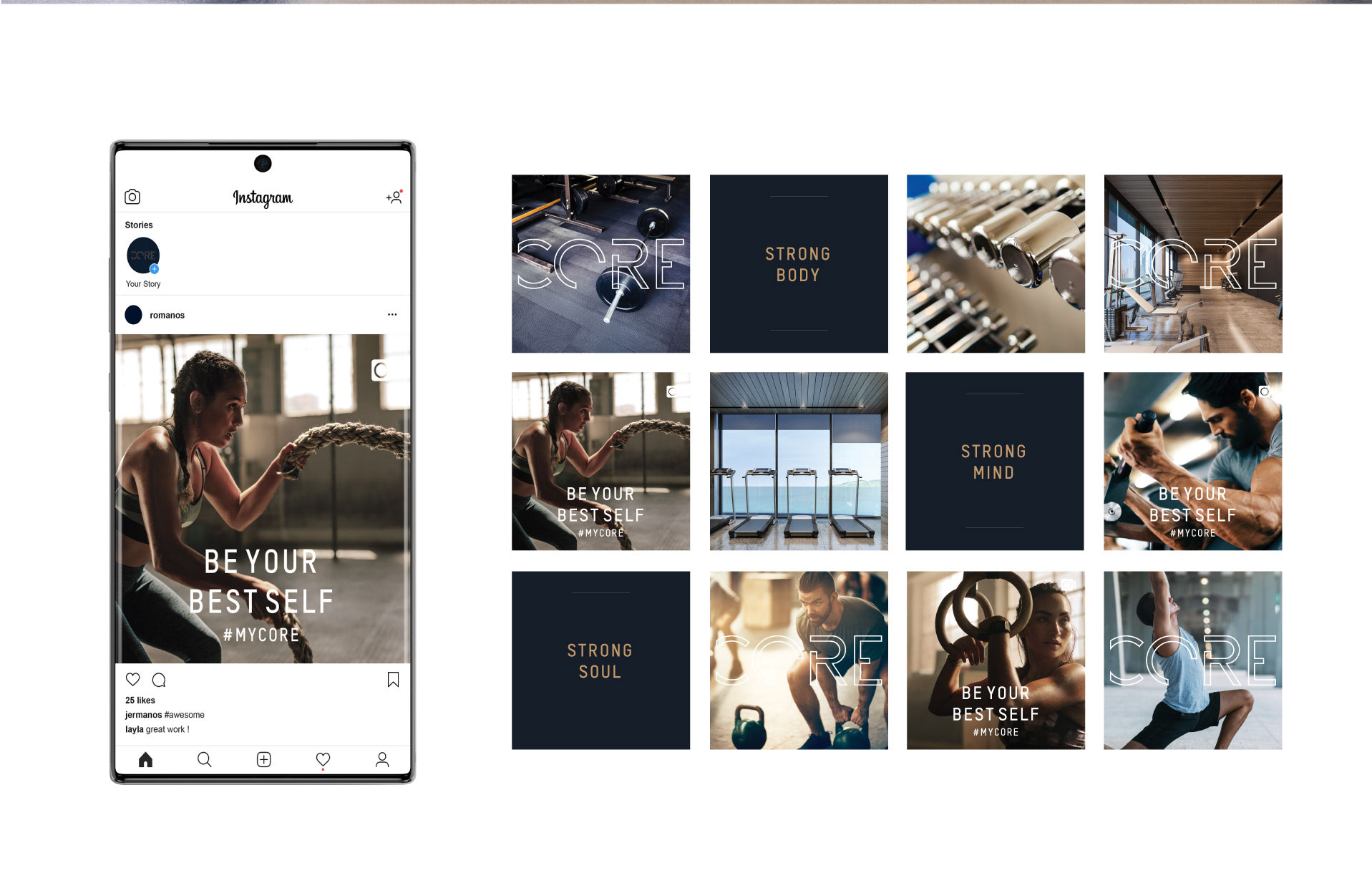
Photography follows the same rule. Low warm daylight, single figures mid movement, equipment shot as objects rather than as machinery. Applications cover stationery, membership collateral, signage and wayfinding, and interior graphics.