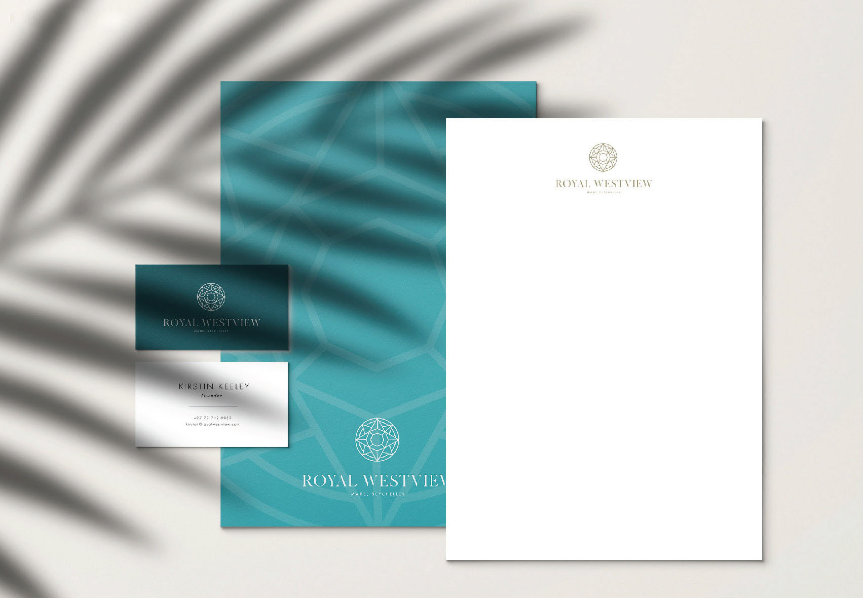
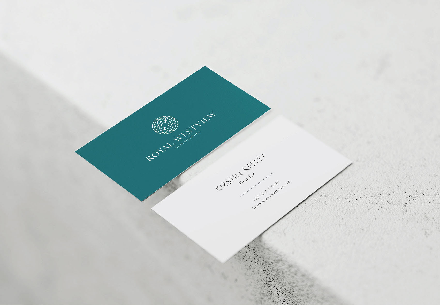
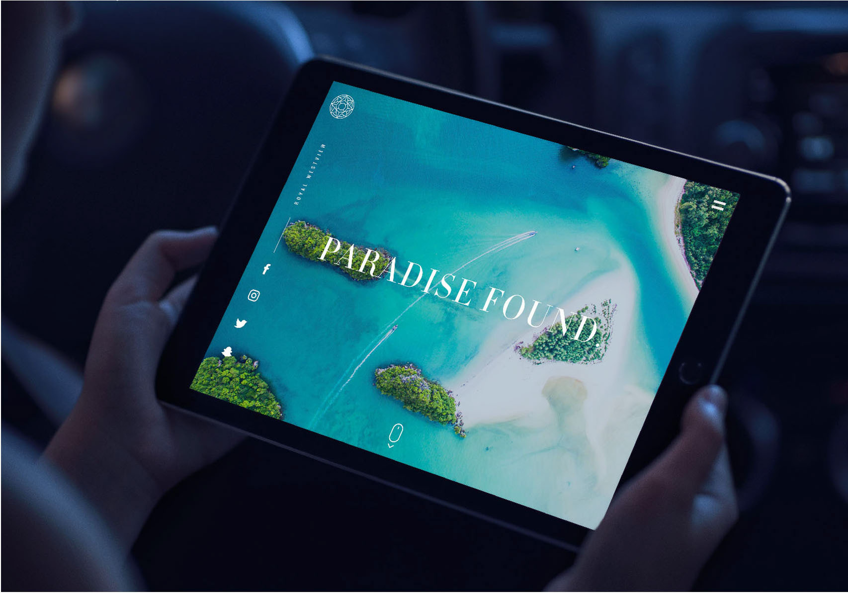
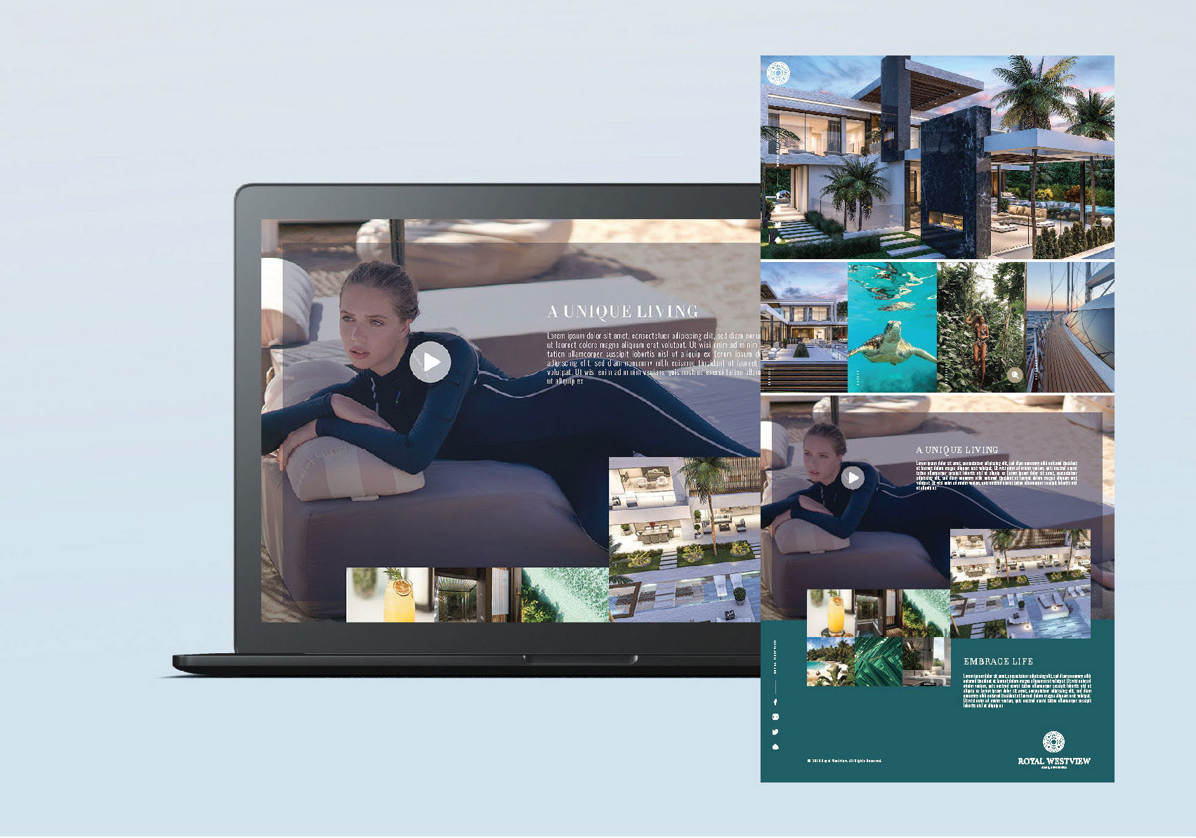
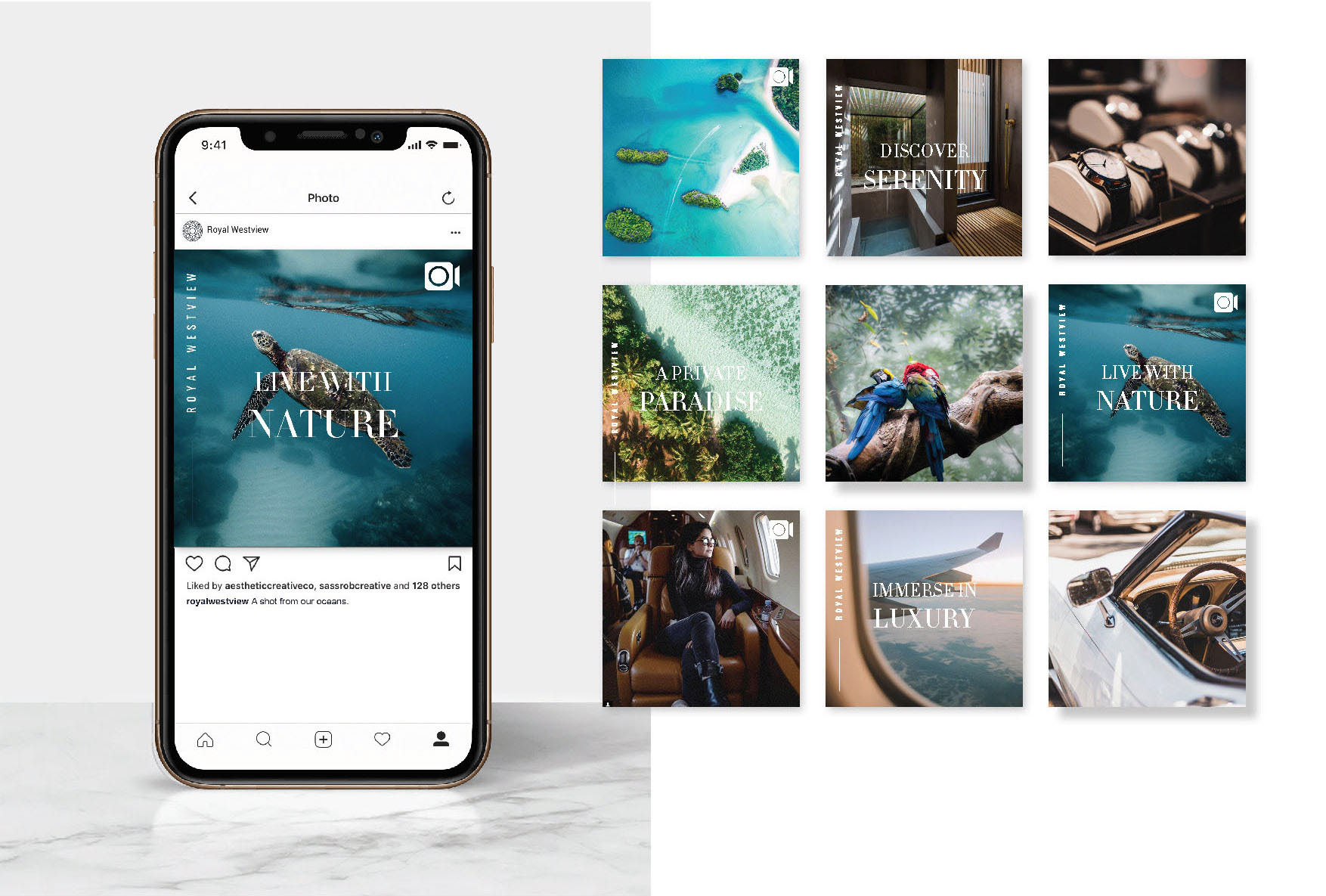
Royal Westview is a private residential development on Mahe in the Seychelles, and this is the identity built for it.
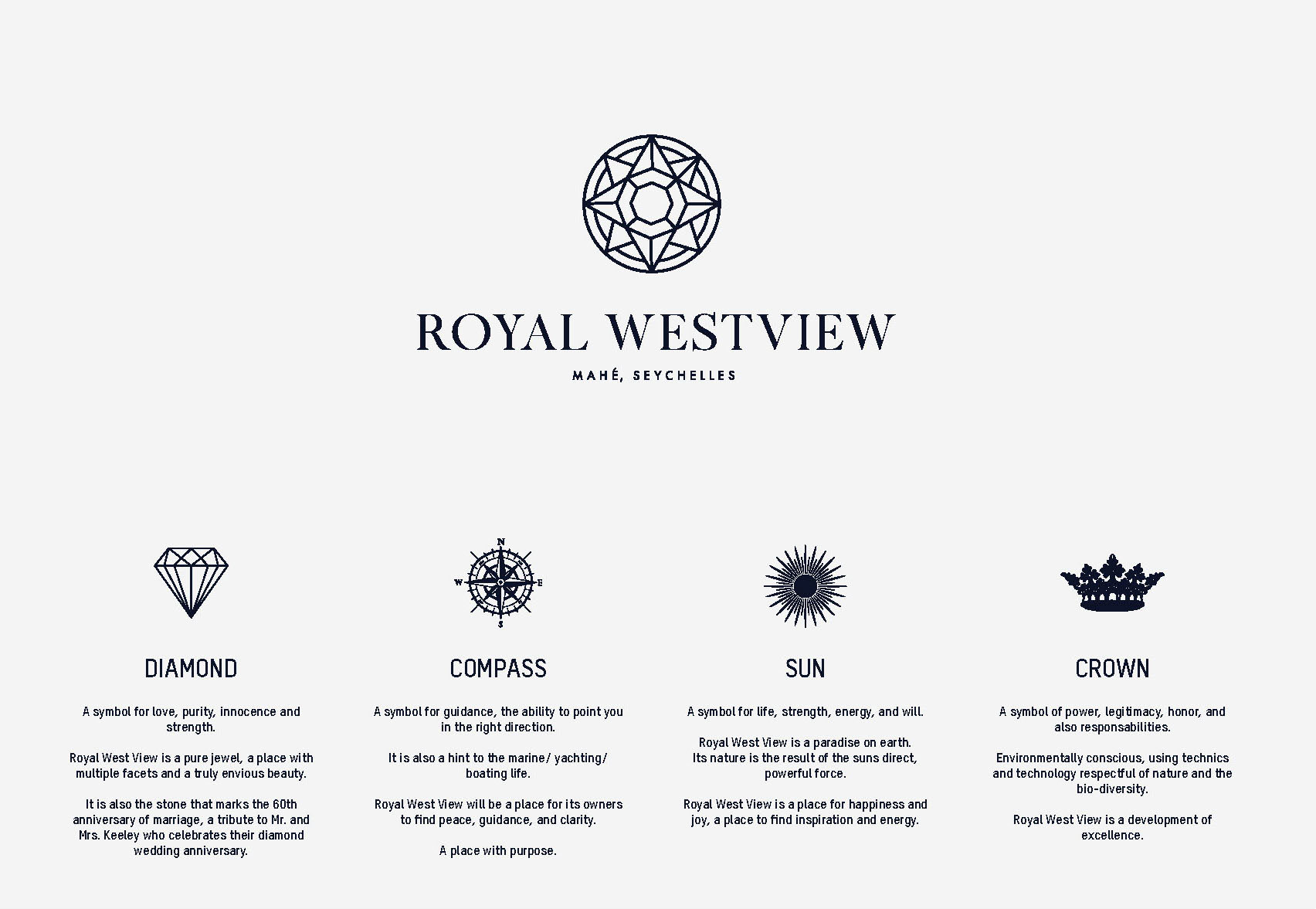
The mark had to carry four ideas at once, and rather than choose between them the system folds all four into a single figure.
Diamond, for love, purity and strength, and a place of many facets. It is also the stone of a sixtieth wedding anniversary, which makes it a direct tribute to the owners. Compass, for guidance and direction, and a nod to the marine and yachting life the island runs on. Somewhere to find peace and clarity. A place with purpose.
Sun, for life, energy and will. The nature on Mahe is the direct result of the sun's force, so the sun belongs in the mark rather than only in the photography. Crown, for power and legitimacy, but also for responsibility: the development is environmentally conscious, using techniques and technology that respect the biodiversity around it.
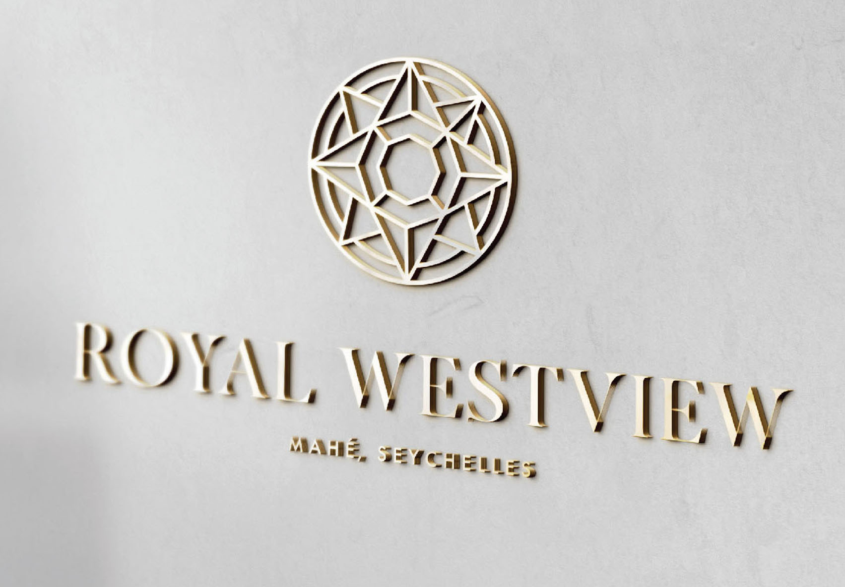
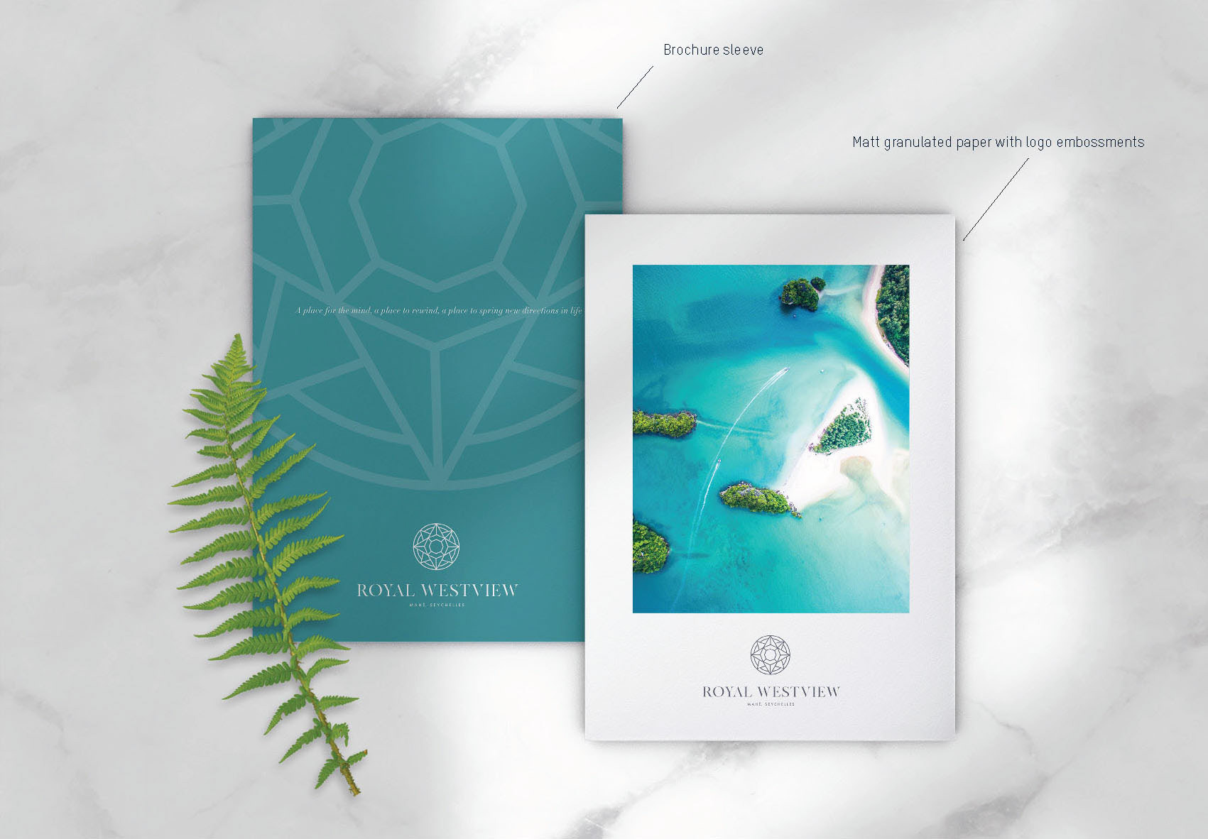
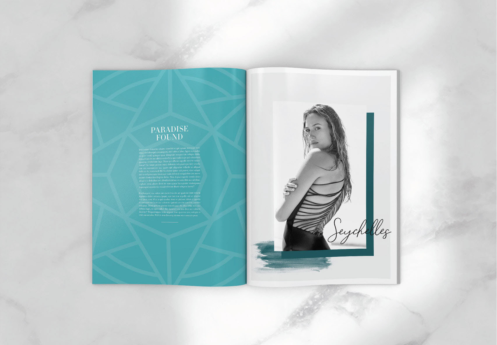
Read as one shape, the monogram is a circular geometric figure in fine line: facets, rays, compass points and the crown's peaks resolved into the same drawing. It works foiled at full size and blind embossed down to a single facet, and the hexagonal grid inside it becomes the pattern for print.
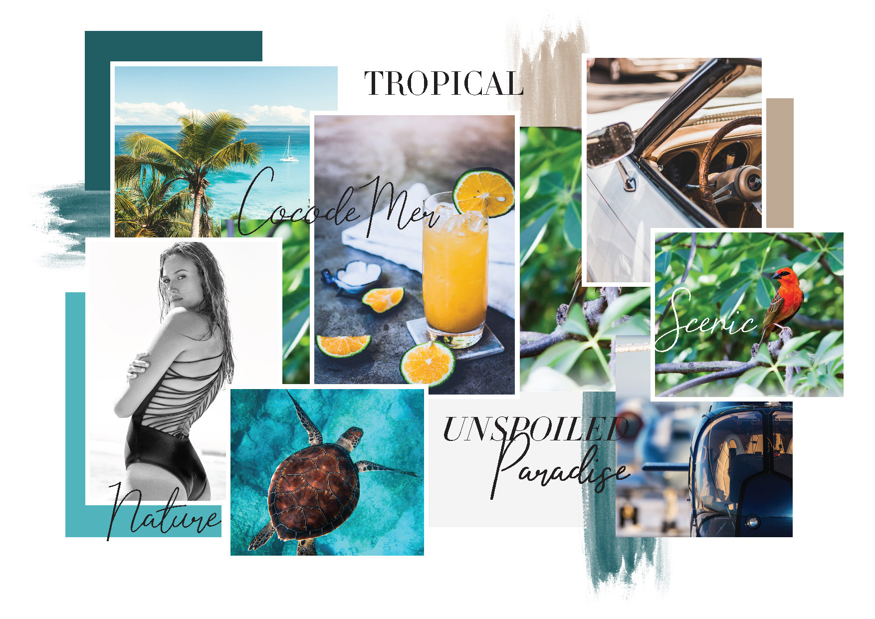
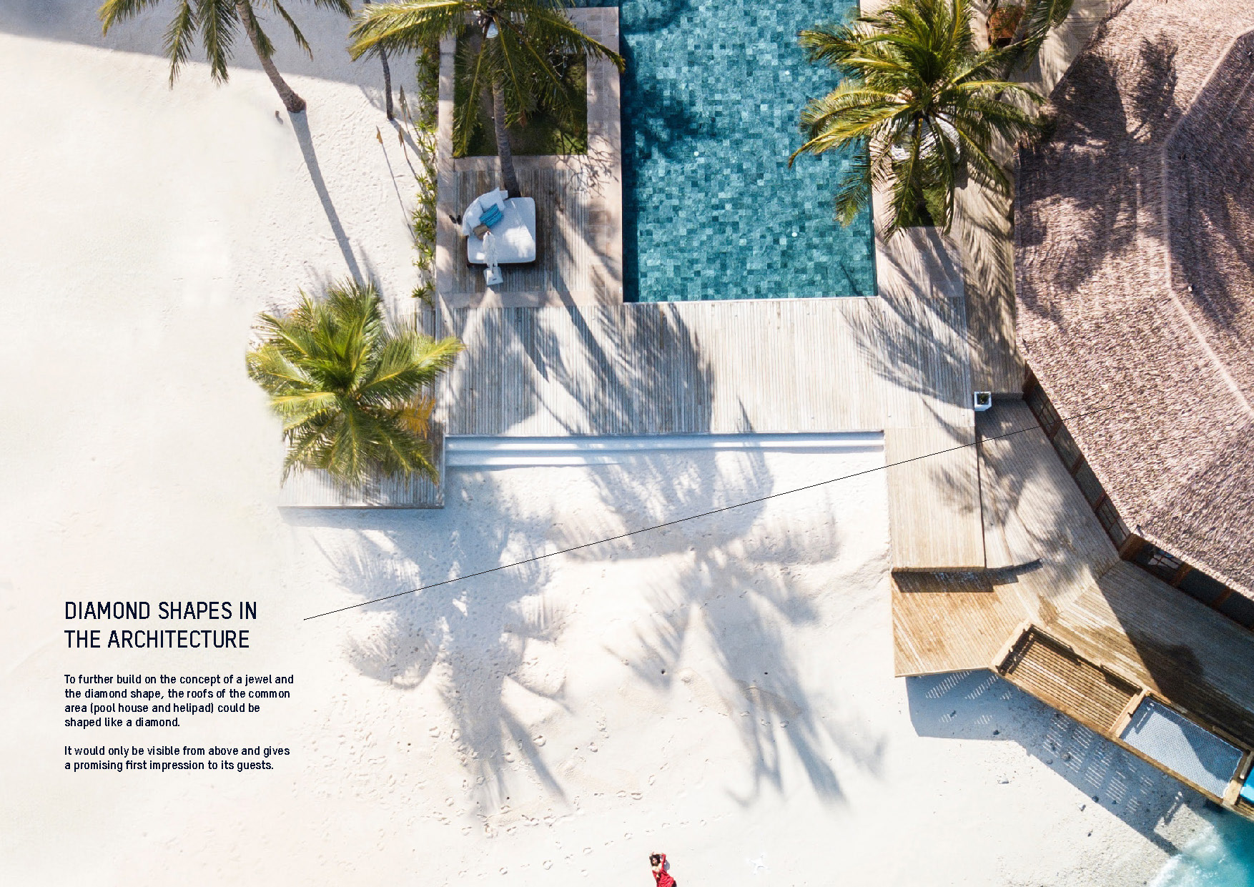
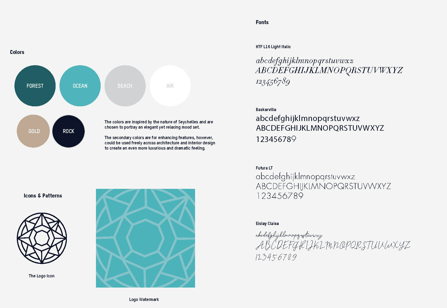
Navy, deep teal and gold, kept cool so the photography carries the warmth. The print specification does as much work as the graphics: matt granulated stock, embossing rather than ink, a brochure sleeve. The visual world is built on unspoiled nature rather than luxury signalling, the coco de mer, endemic birds, turtles, water, with the villa placed inside it.