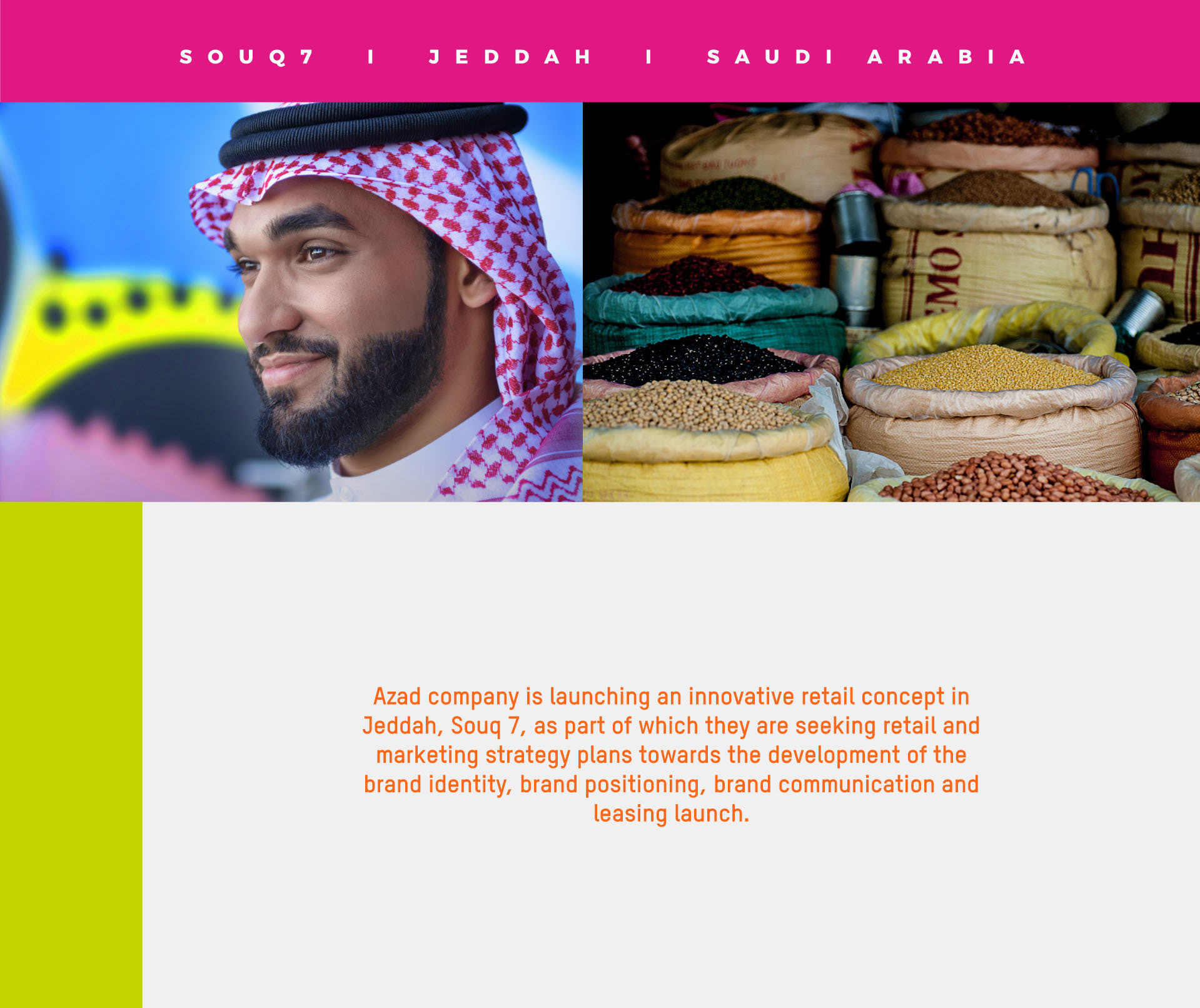
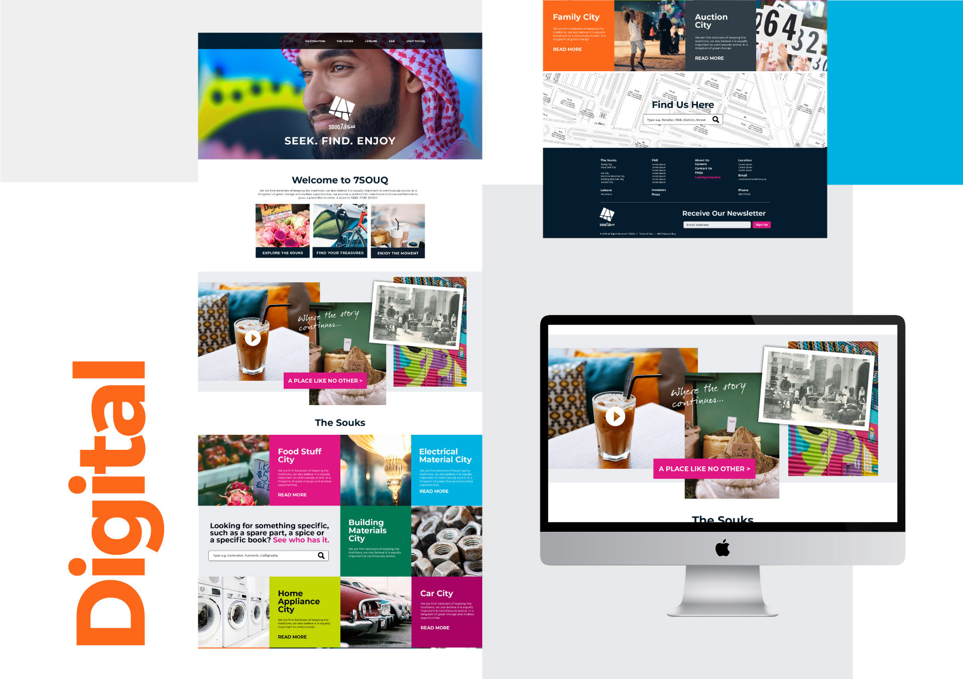
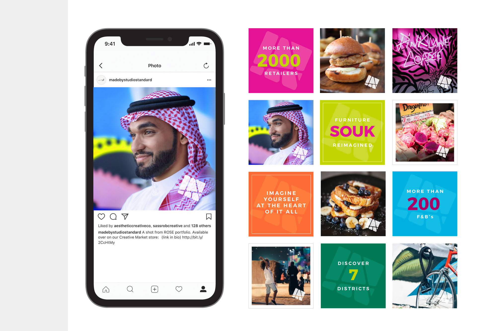
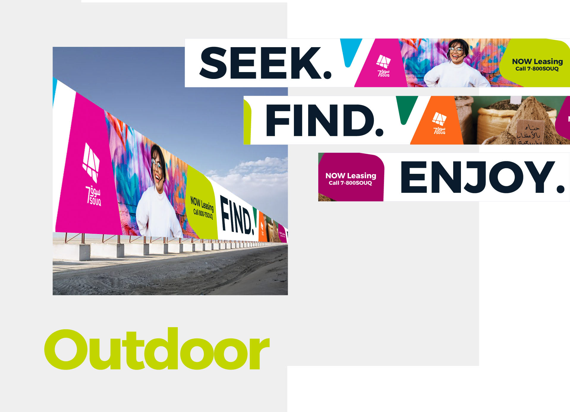
Souq 7 is a retail destination in Jeddah developed by Azad, and the brief covered the whole stack: retail and marketing strategy, brand positioning, identity, communication and the leasing launch.
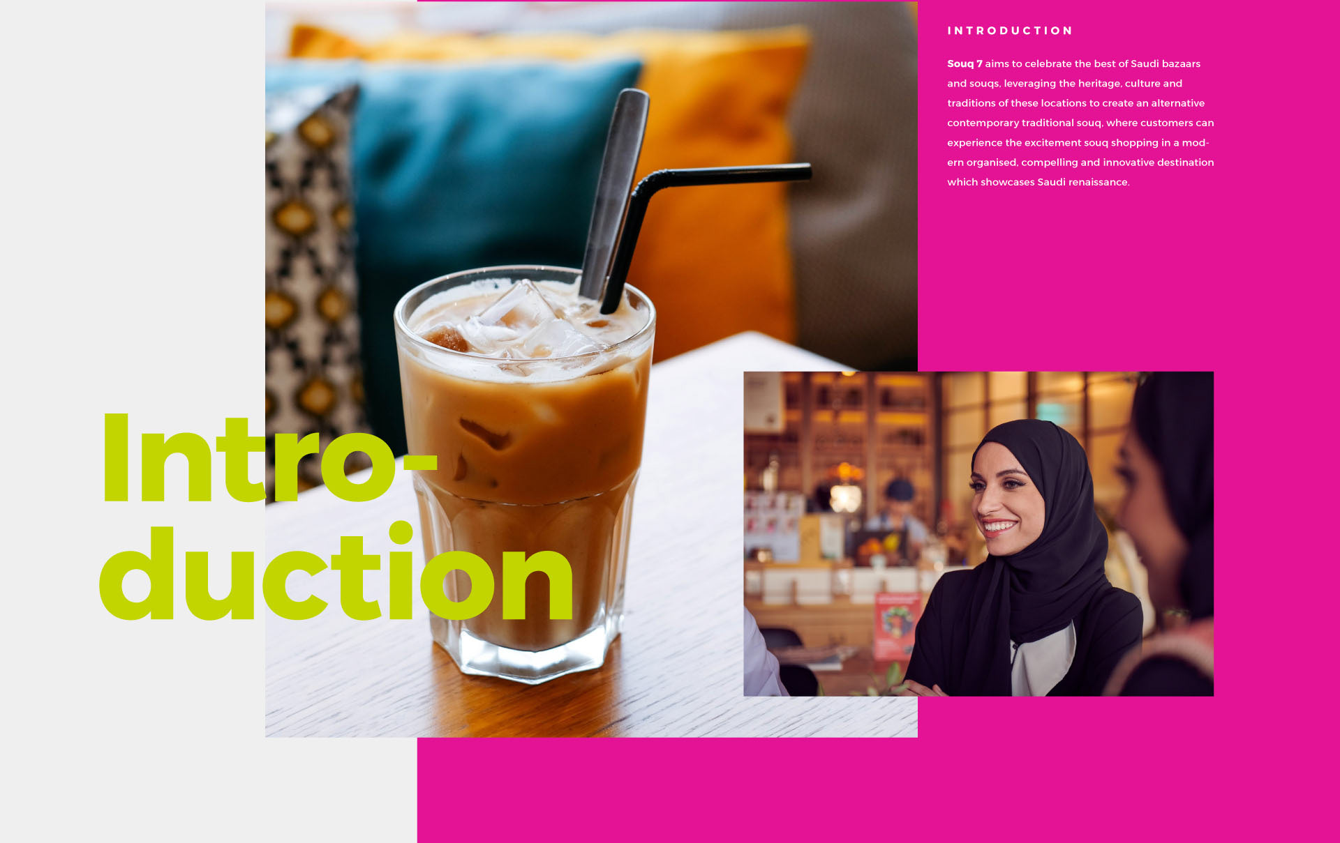
The ambition set at the start was to celebrate the best of Saudi bazaars and souqs, taking the heritage, culture and traditions of those places and building a contemporary version of them. Somewhere organised and modern that still reads as a souq rather than a mall, at a scale of more than 2,000 retailers and over 200 food and beverage units.
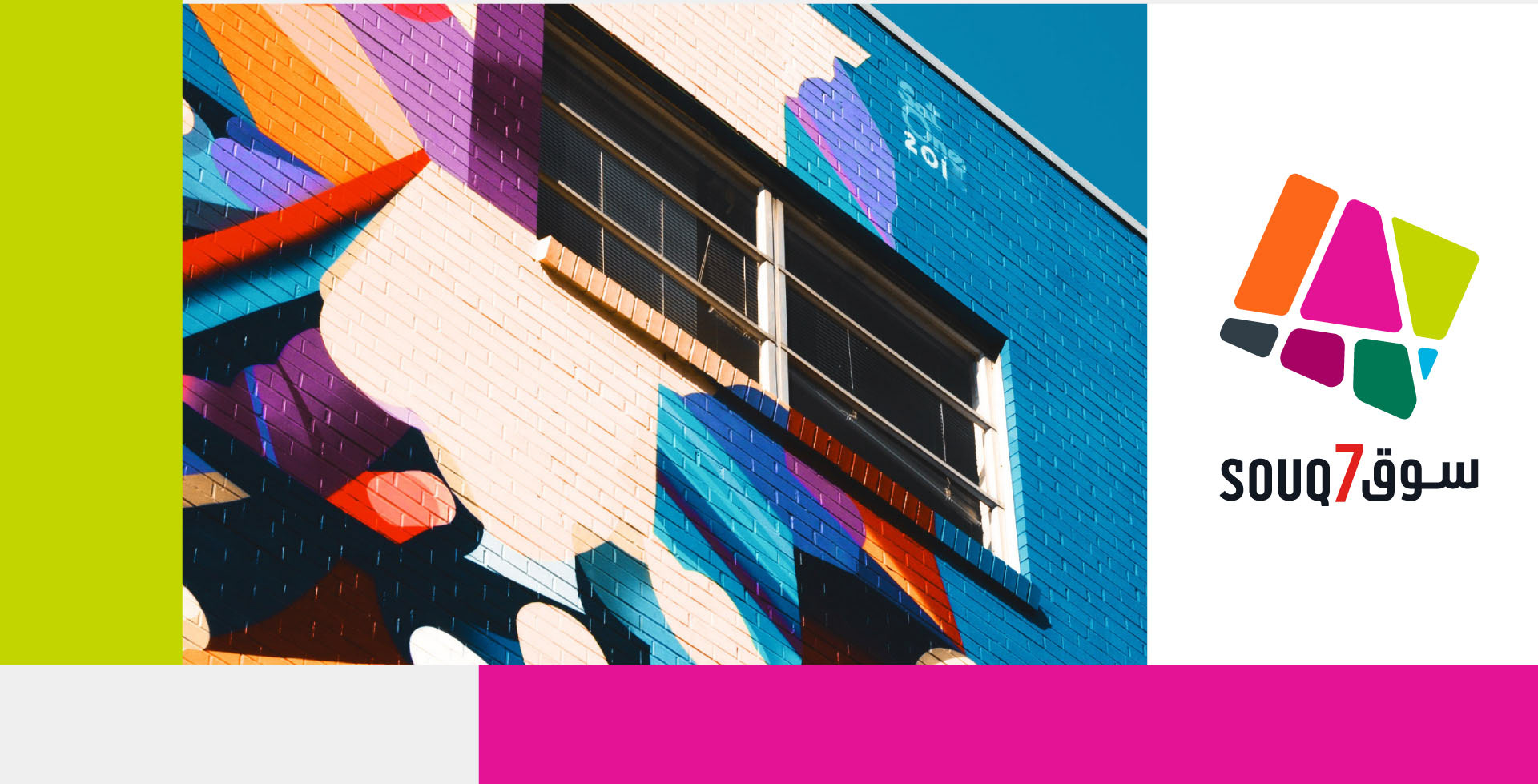
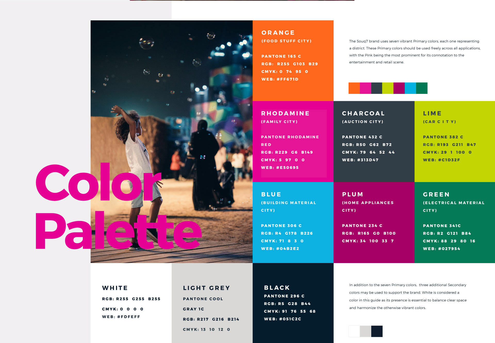
The organising idea is that Souq 7 is not one market but seven districts, and colour is how you navigate it. Orange is Food Stuff City, Rhodamine is Family City, Charcoal is Auction City, Lime is Car City, with blue, plum and green carrying the rest. Pink leads the system because it reads as entertainment and retail rather than trade.
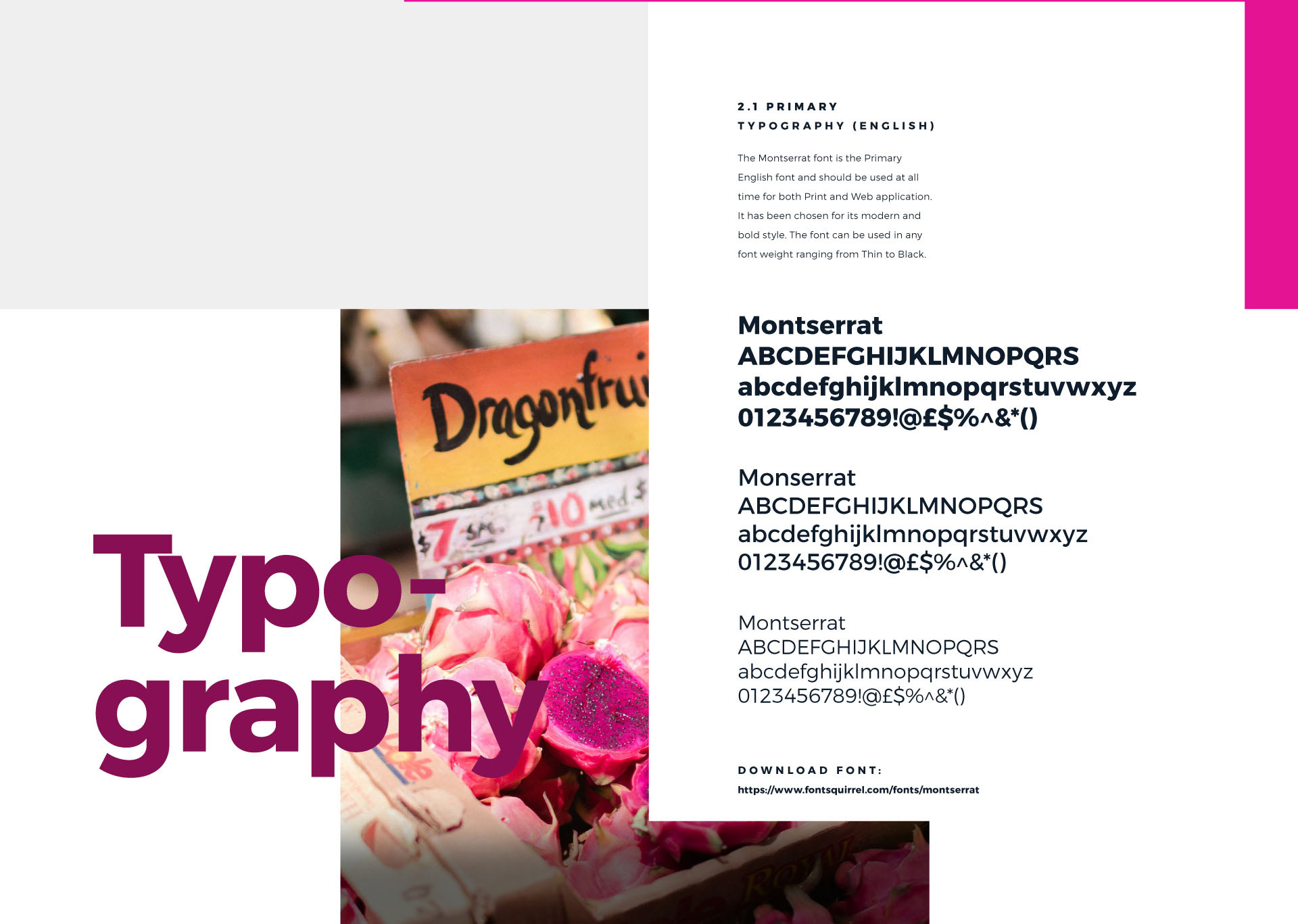
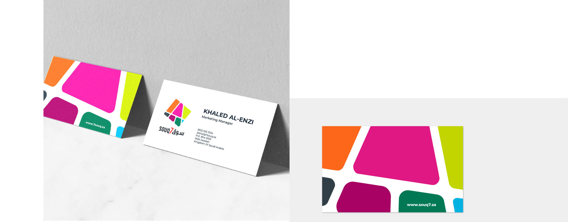
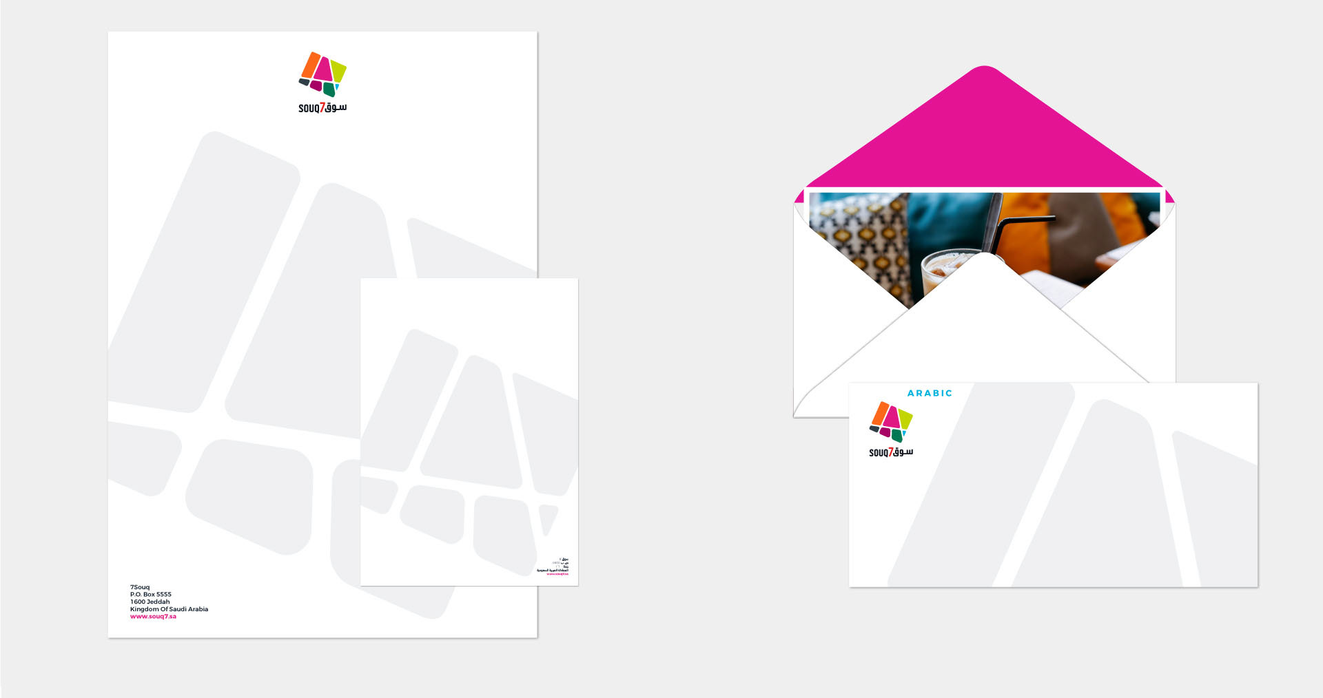
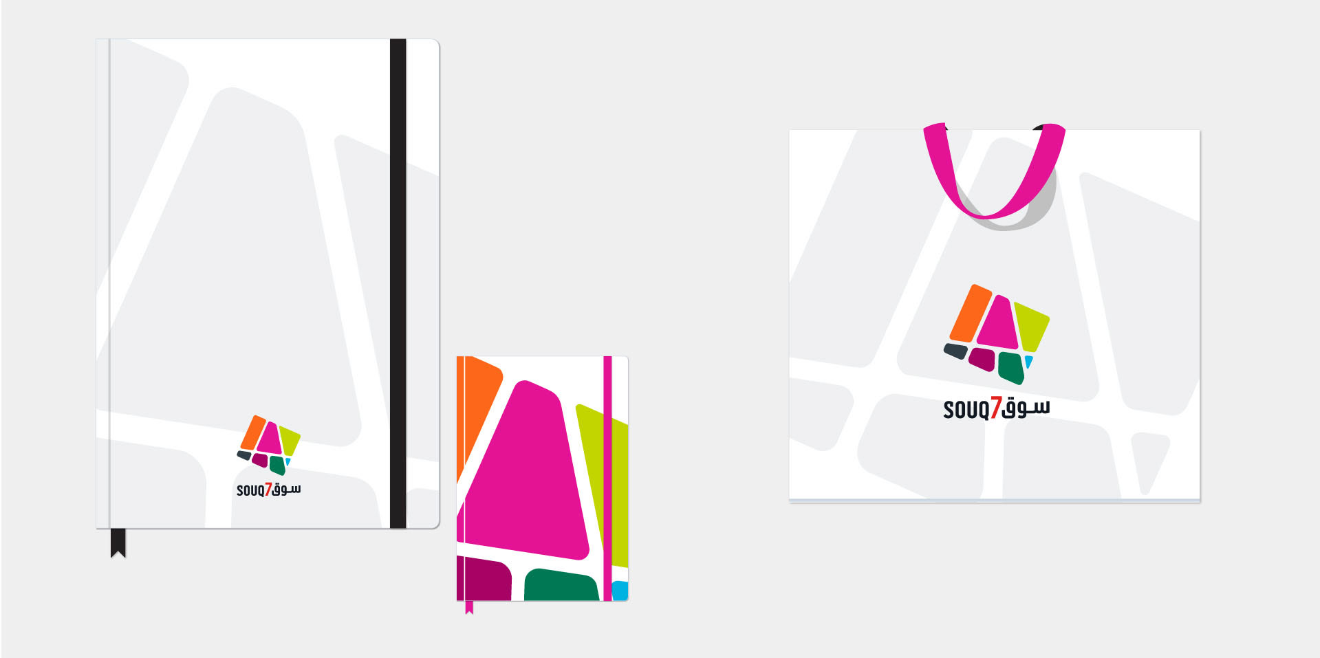
The mark follows the same logic. A cluster of tilted colour panels, one per district, sitting together as a single souq, set bilingually in English and Arabic. It works as a full lockup, as a pattern, and cropped to one panel when a district needs to speak on its own. Montserrat carries the typography from brochure size to signage size without a second family.
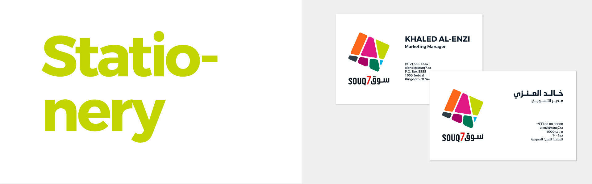
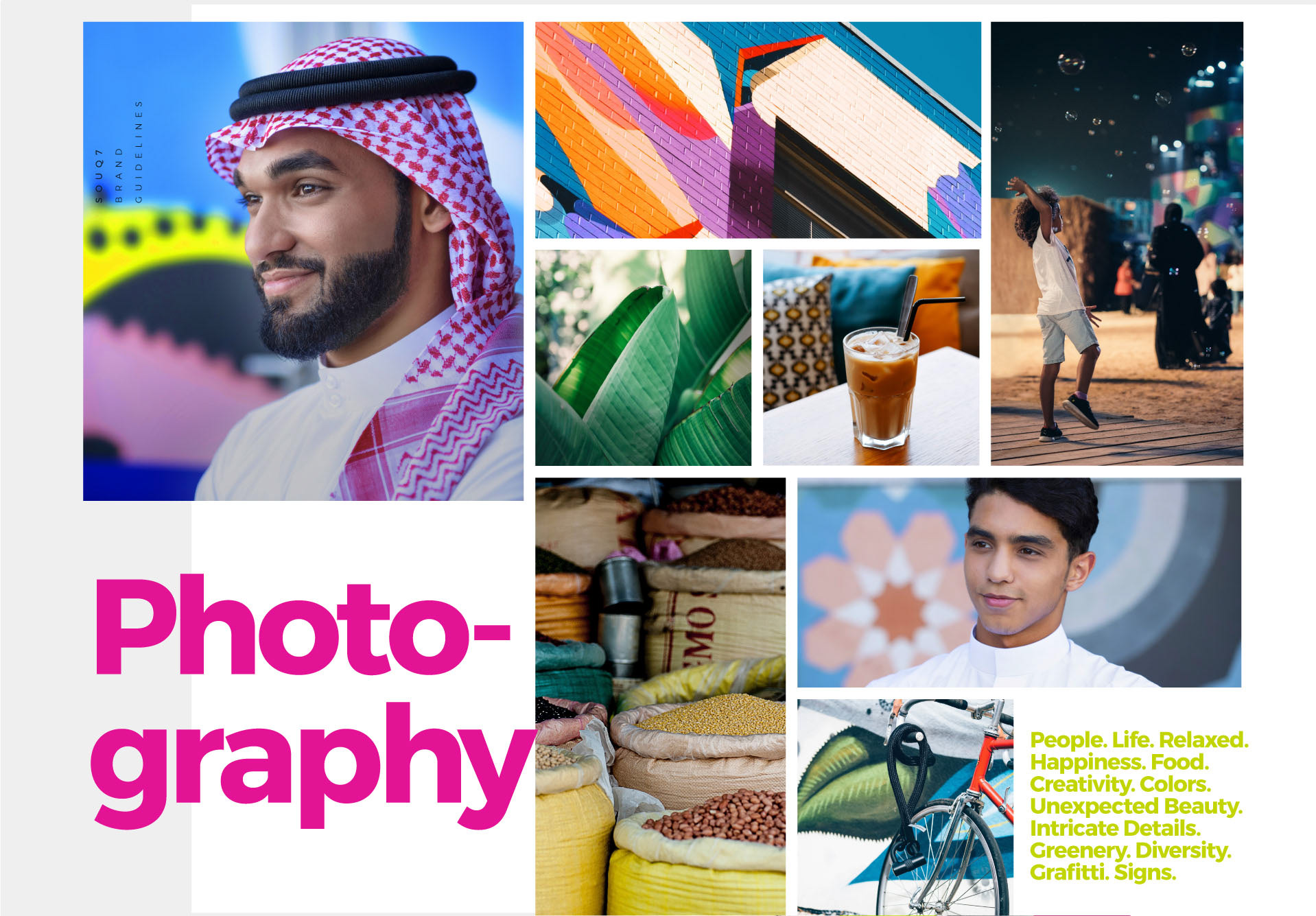
Applications cover the brand guidelines, stationery, social campaign, site hoardings and the leasing launch. The seven colour rule is what holds it together: a new district can enter the system without anyone redesigning it, which for a market that will keep growing is the whole point.