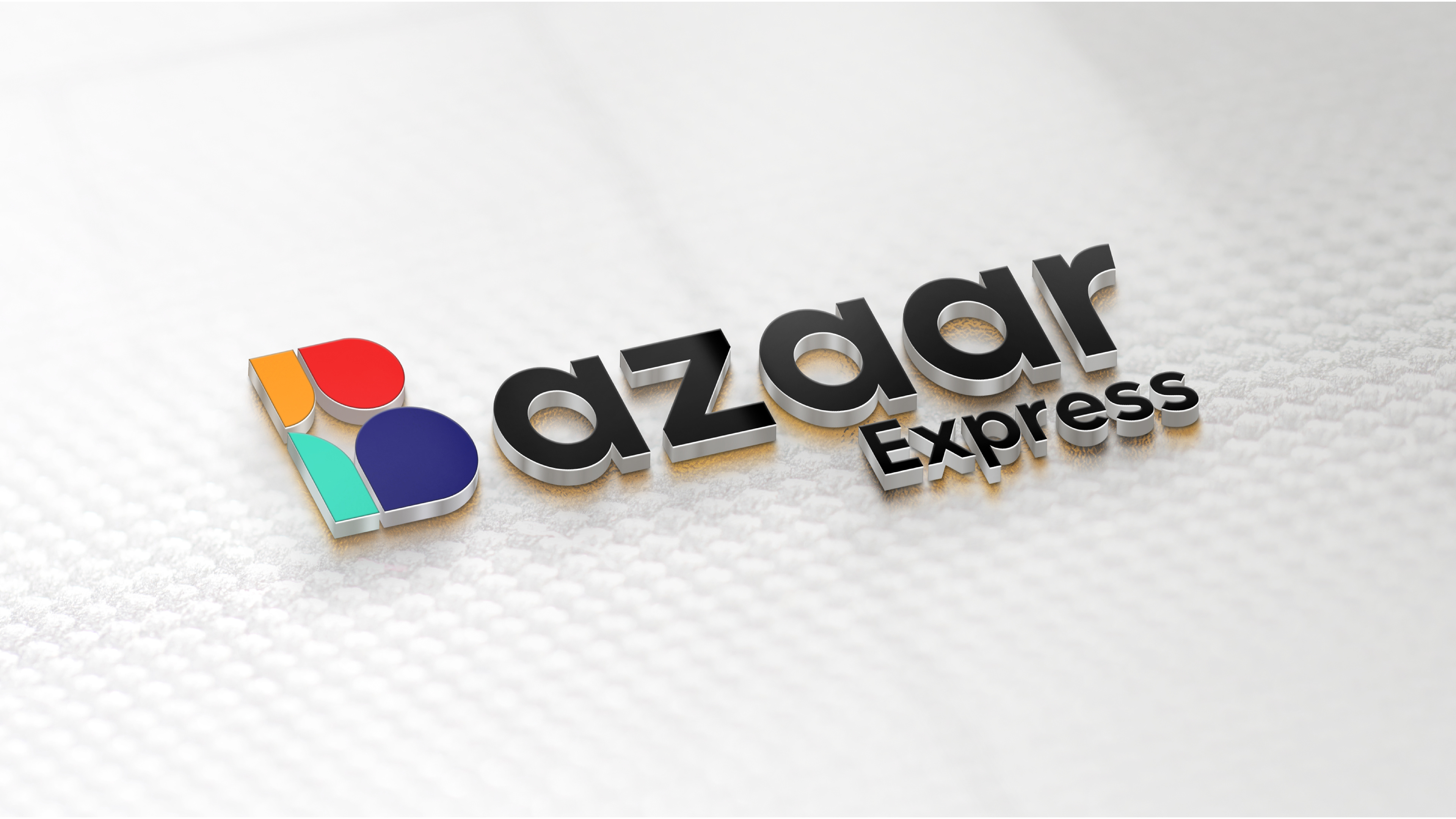

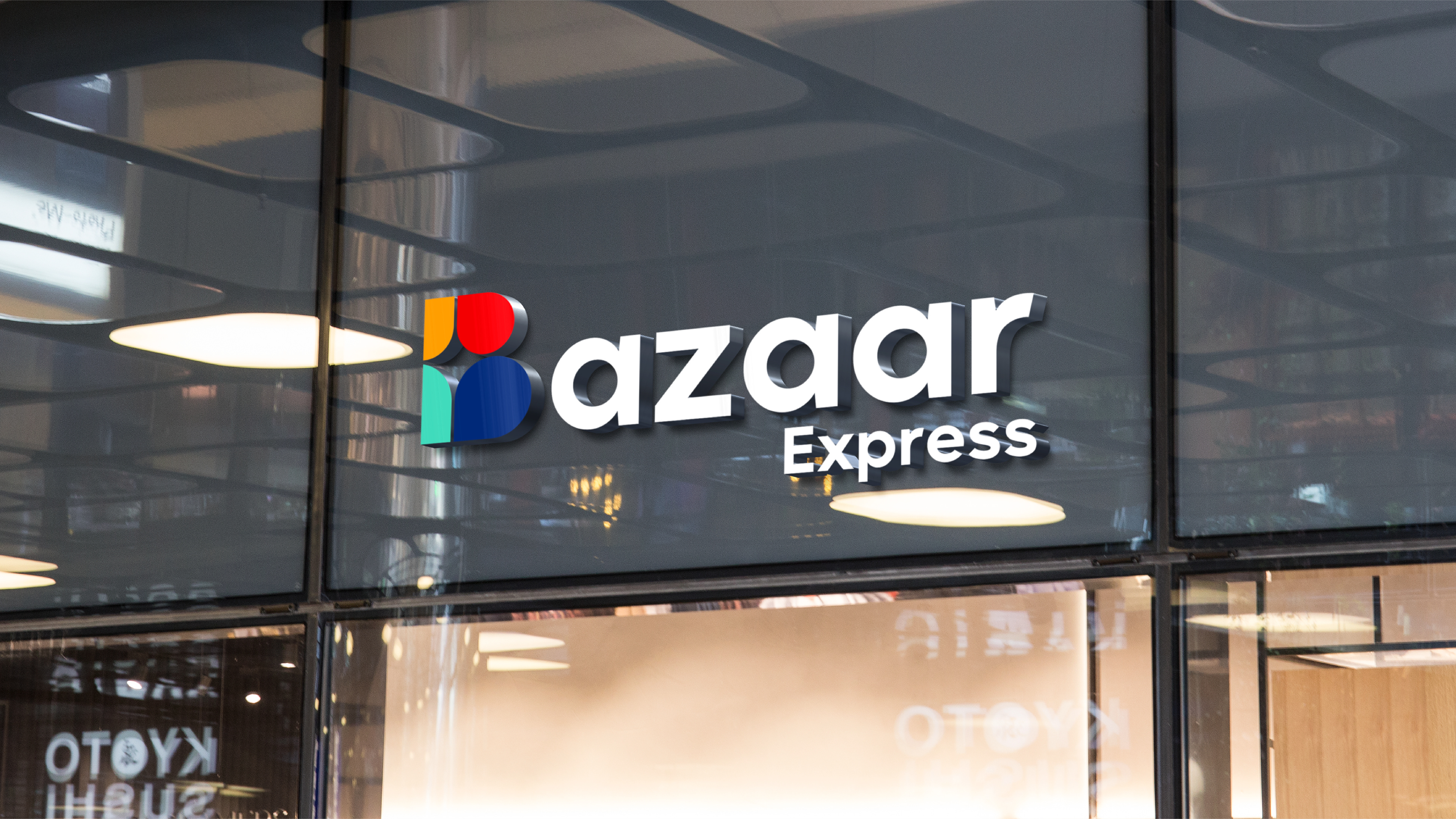
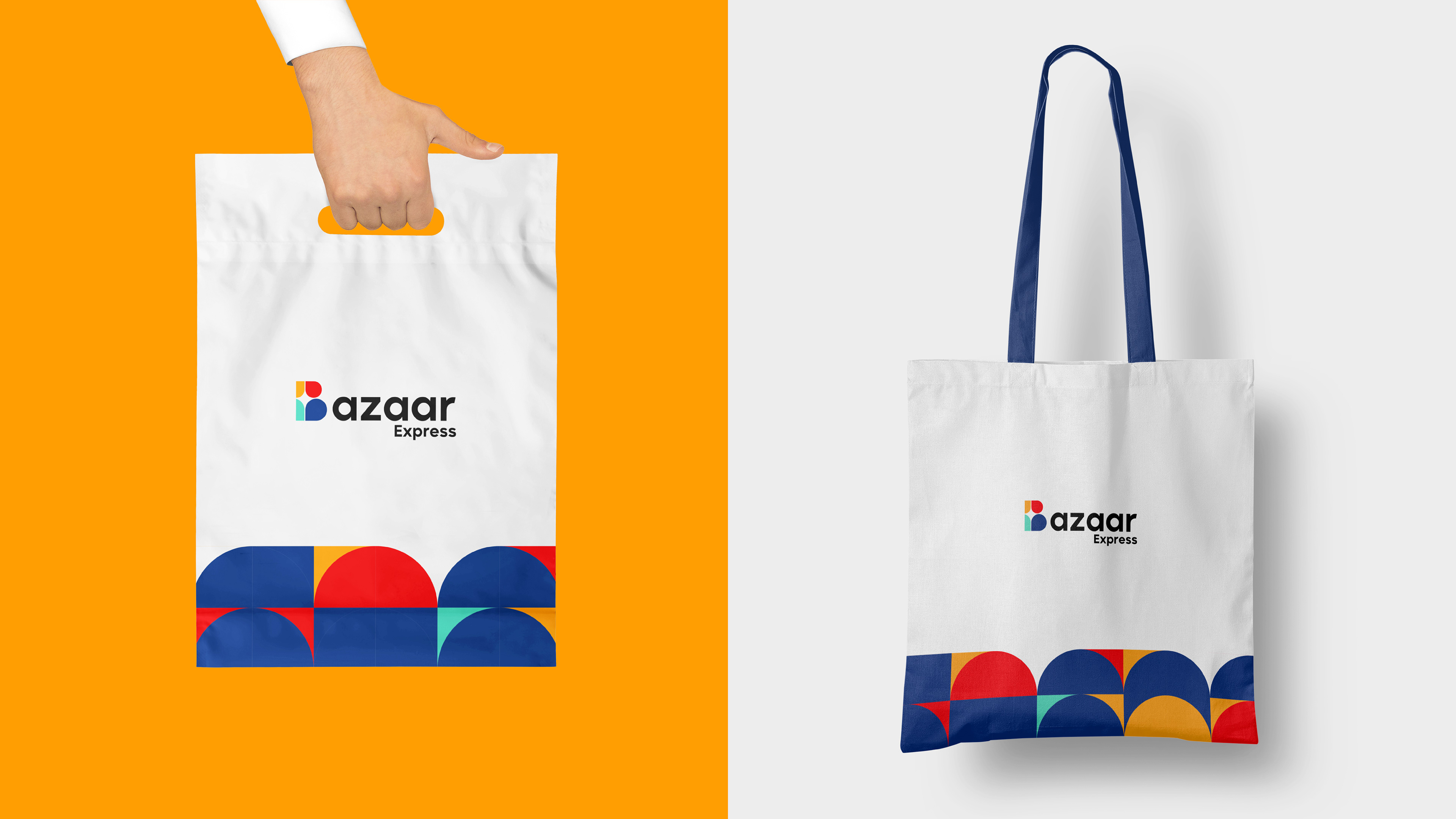
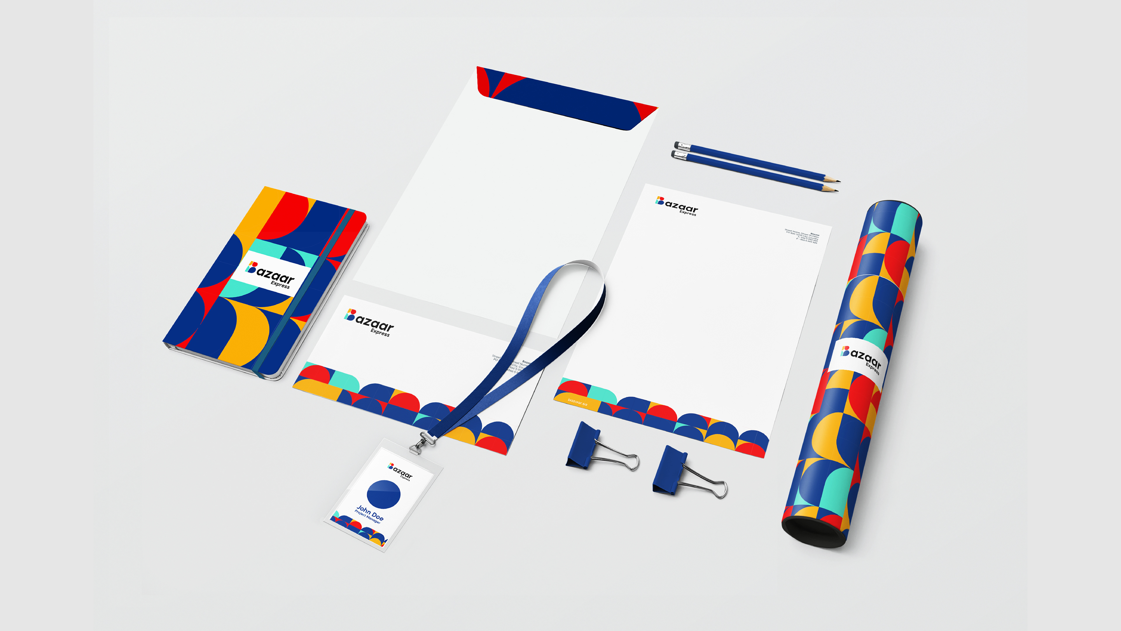
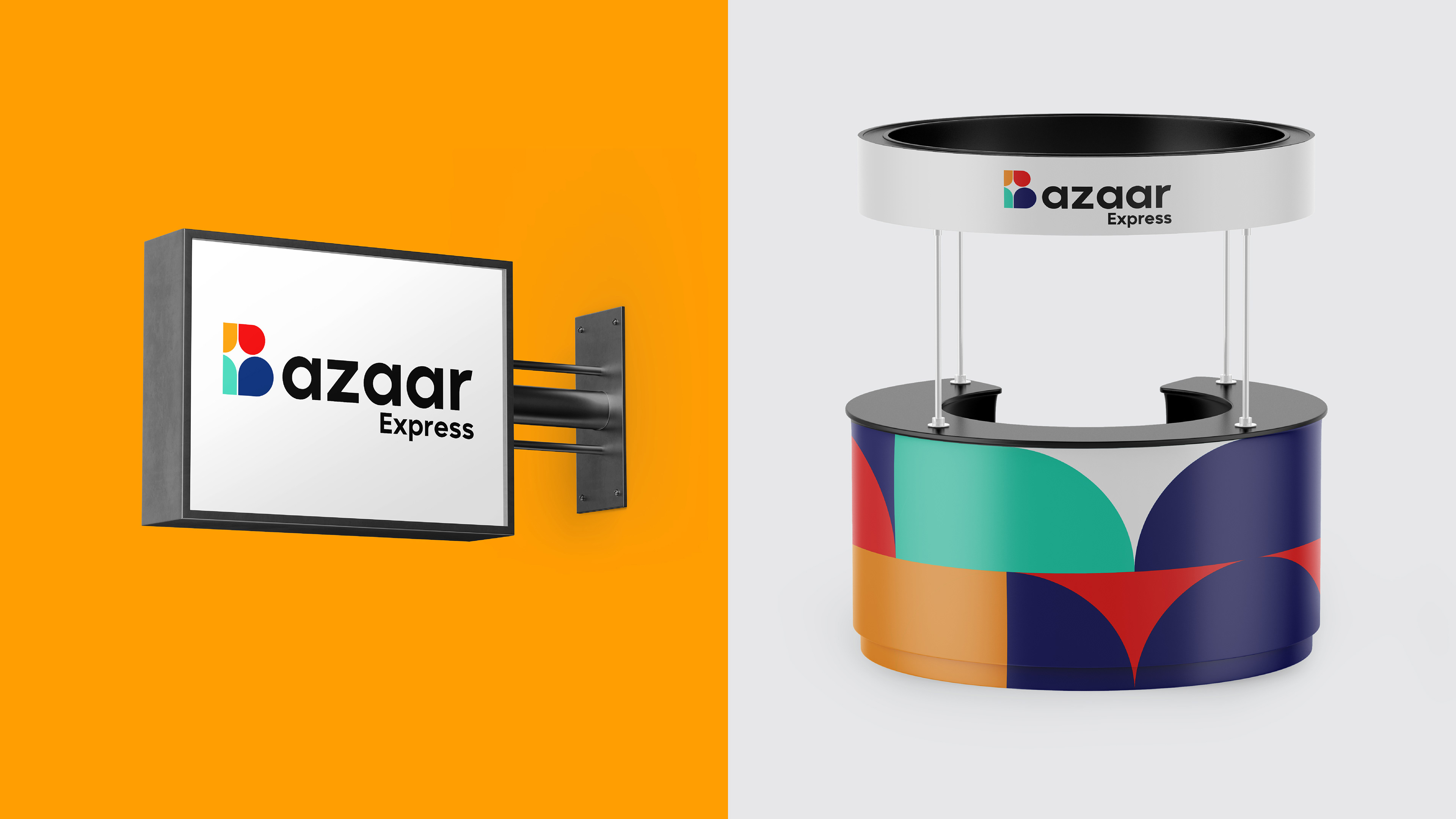
Bazaar Express is a Saudi convenience retail brand, and the identity is built so the mark can be read at a glance and reproduced by anyone.
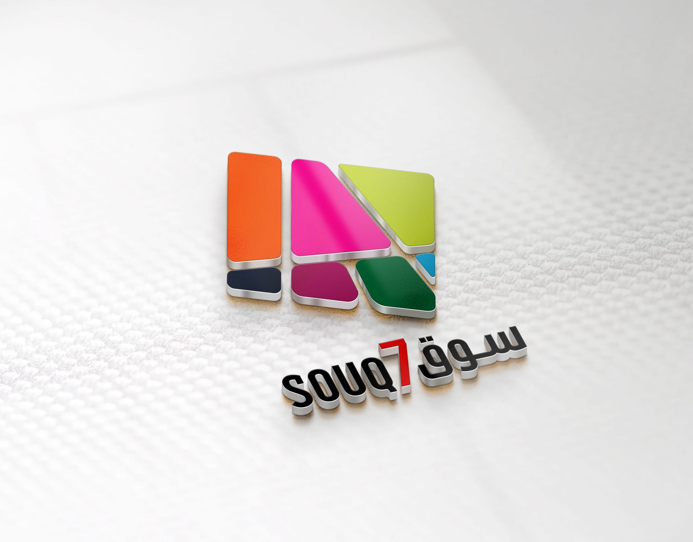
The B is not drawn as a letter. It is assembled from flat coloured segments that stack into the shape of a B while reading as awnings and stall canopies. It is the market condensed into one character, and because it is built from a few flat pieces on a construction grid it enlarges to a shopfront or shrinks to a price label without being redrawn.
Colour does the rest. Orange, coral, teal and navy, fully saturated and used flat, never blended. Four colours give the brand enough range to code categories and enough consistency to stay recognisable across a busy retail floor.
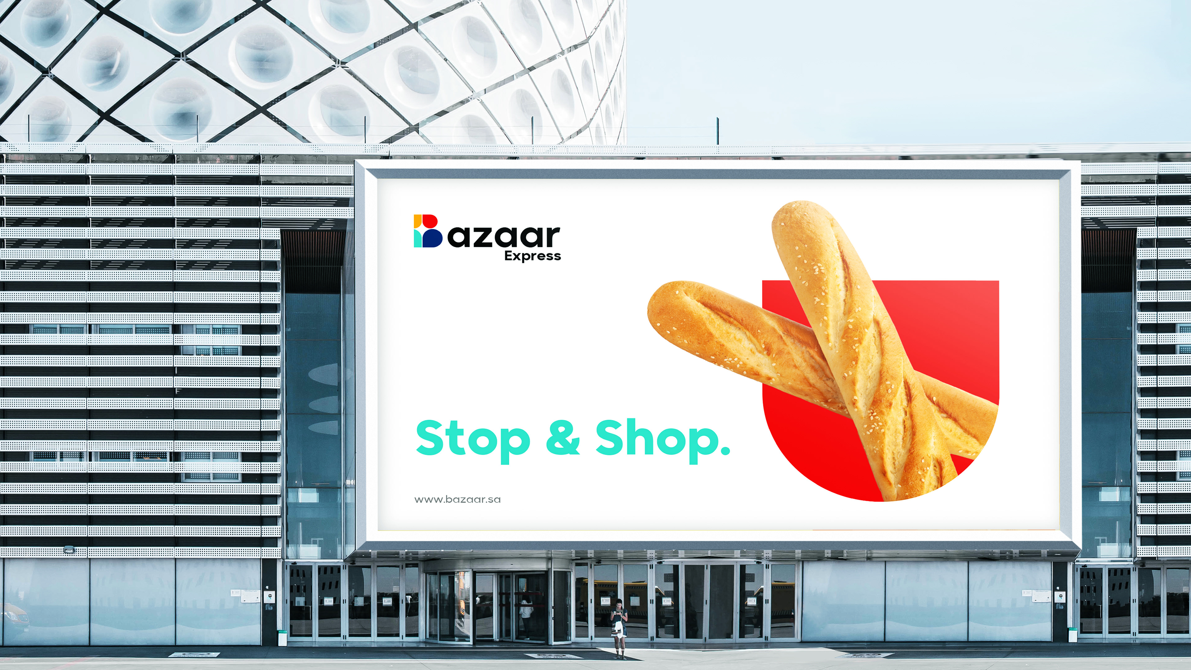
The wordmark sits in a plain geometric sans in black, deliberately quiet, so the colour block carries the recognition and the type only names it. The line is Stop and Shop, which is what a convenience brand is actually selling: not choice, but the removal of a decision.
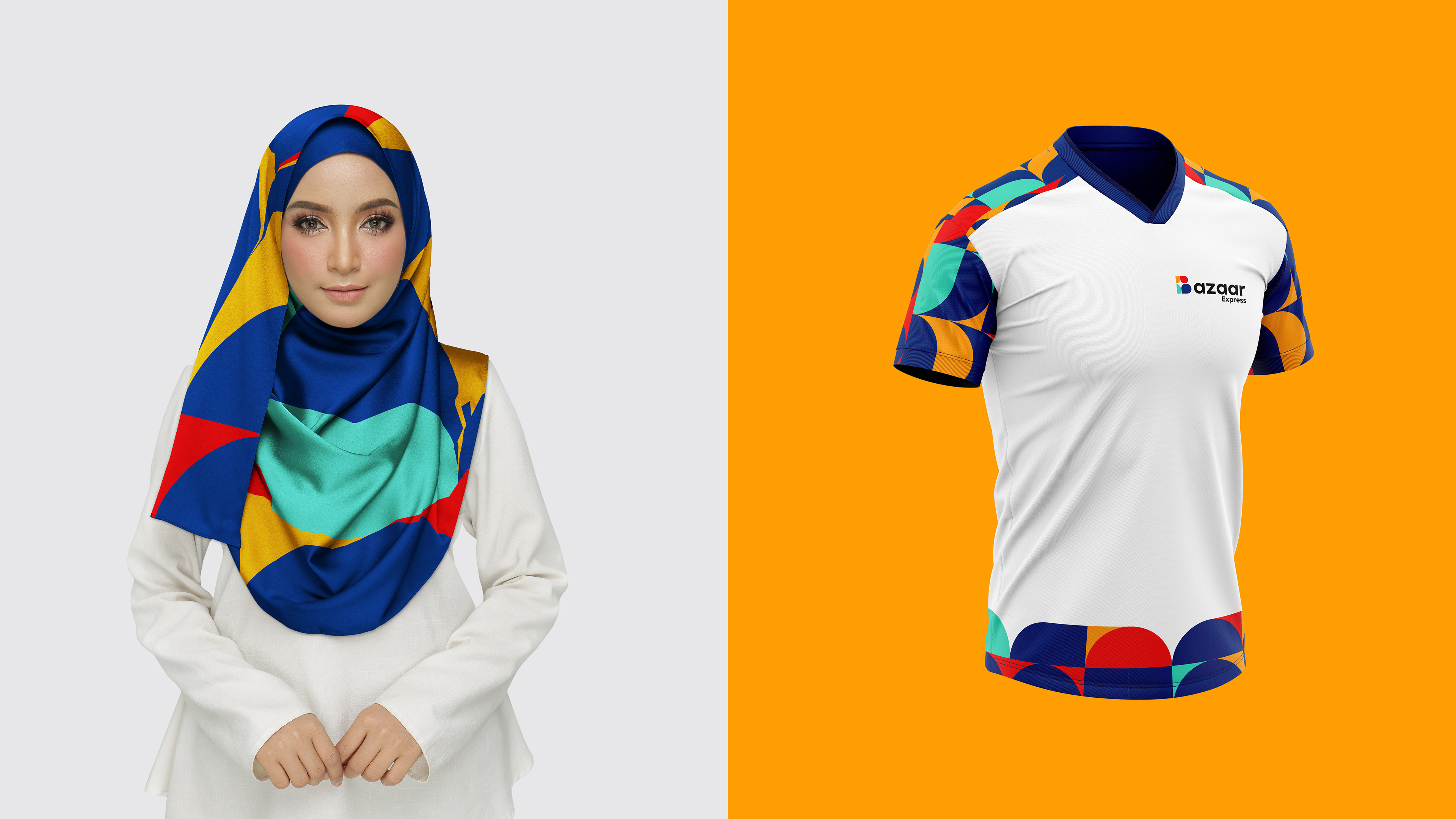
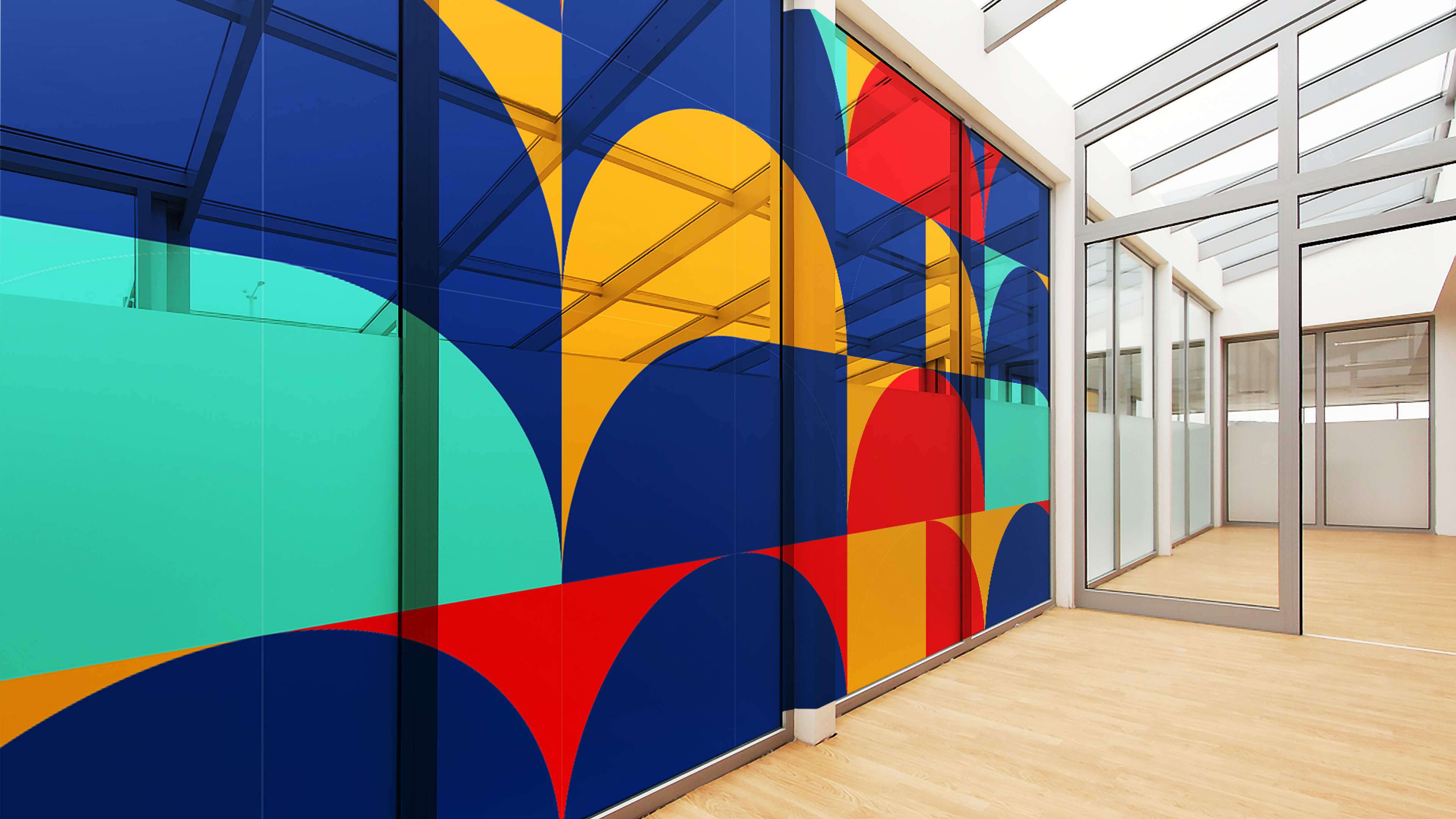
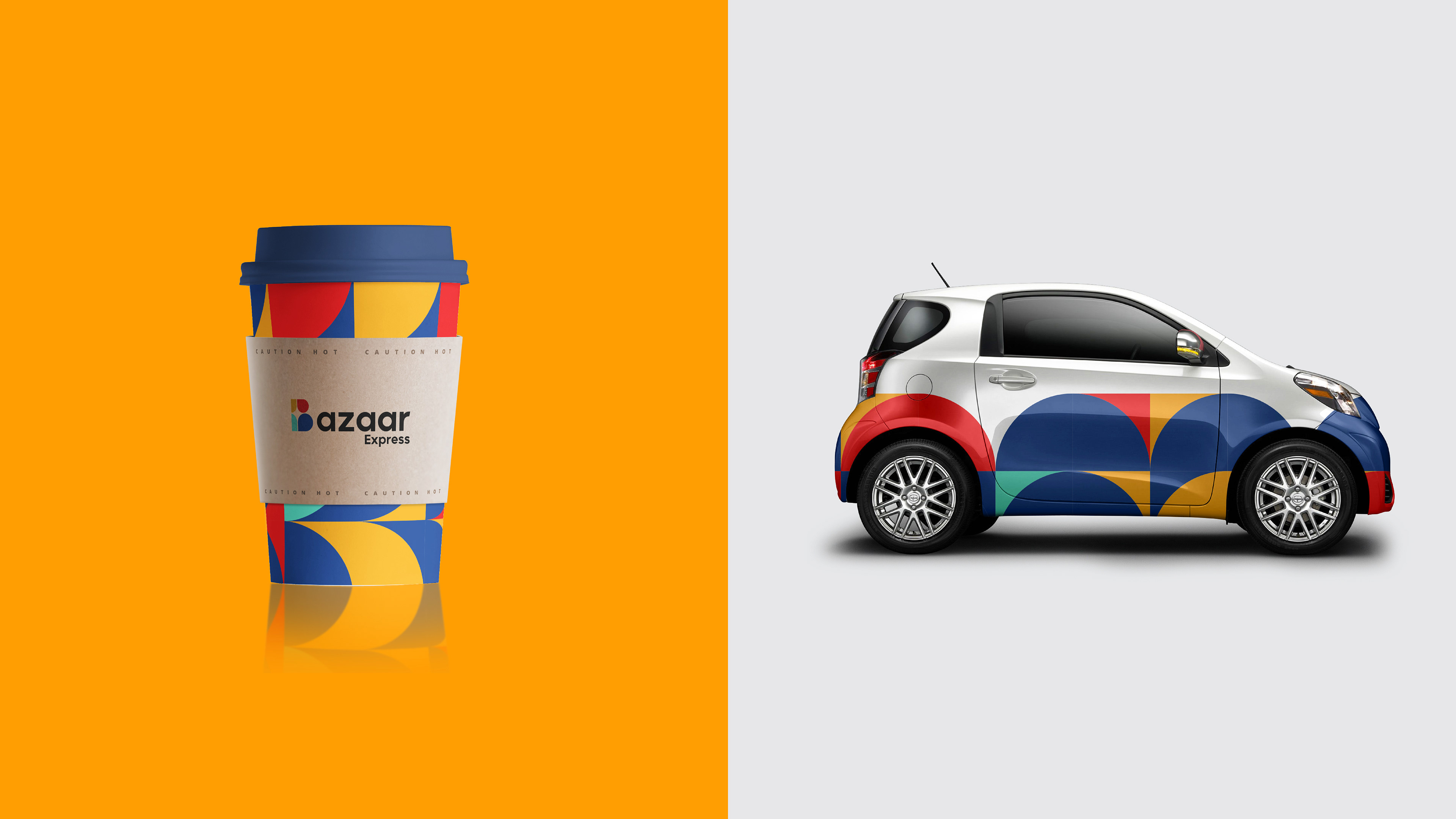
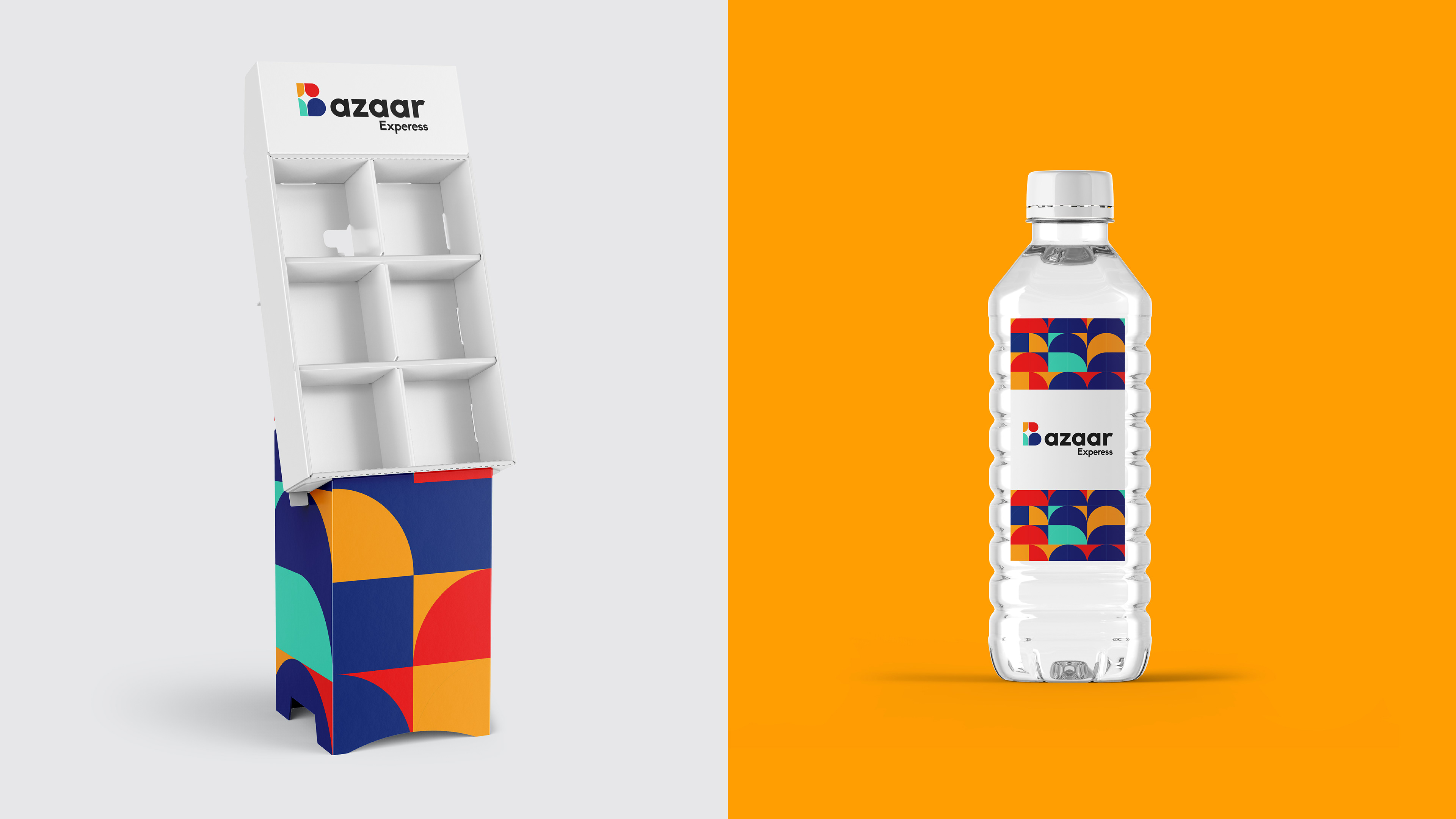
Applications cover storefront signage and facade advertising, uniform, packaging, retail environment and print.