
Kun Sports is a corporate holding brand for lifestyle and wellness concepts, and the name is the idea. Kun is the Arabic imperative be. Not a description of a business, an instruction to the person reading it.
The positioning the brand sets for itself is inspired by life and the need to live well: young, vibrant and welcoming, but also edgy, modern and solid enough to read as a holding company rather than a single gym.
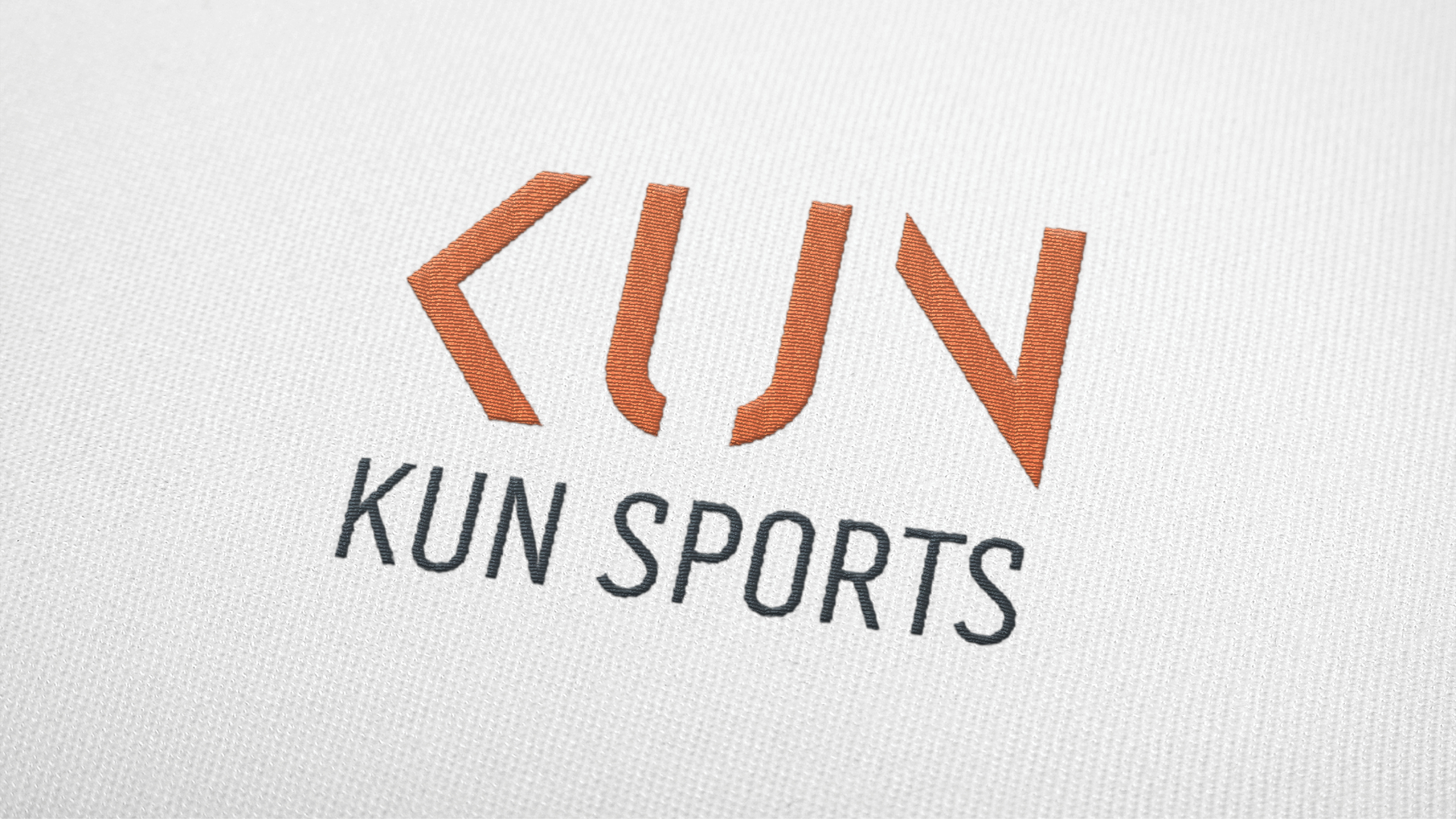
The logotype carries both halves. K, U and N are cut as angular strokes with the rhythm of a brush rather than a typeface, orange against charcoal. Warm enough to feel like effort, dark enough not to look like a discount retailer.
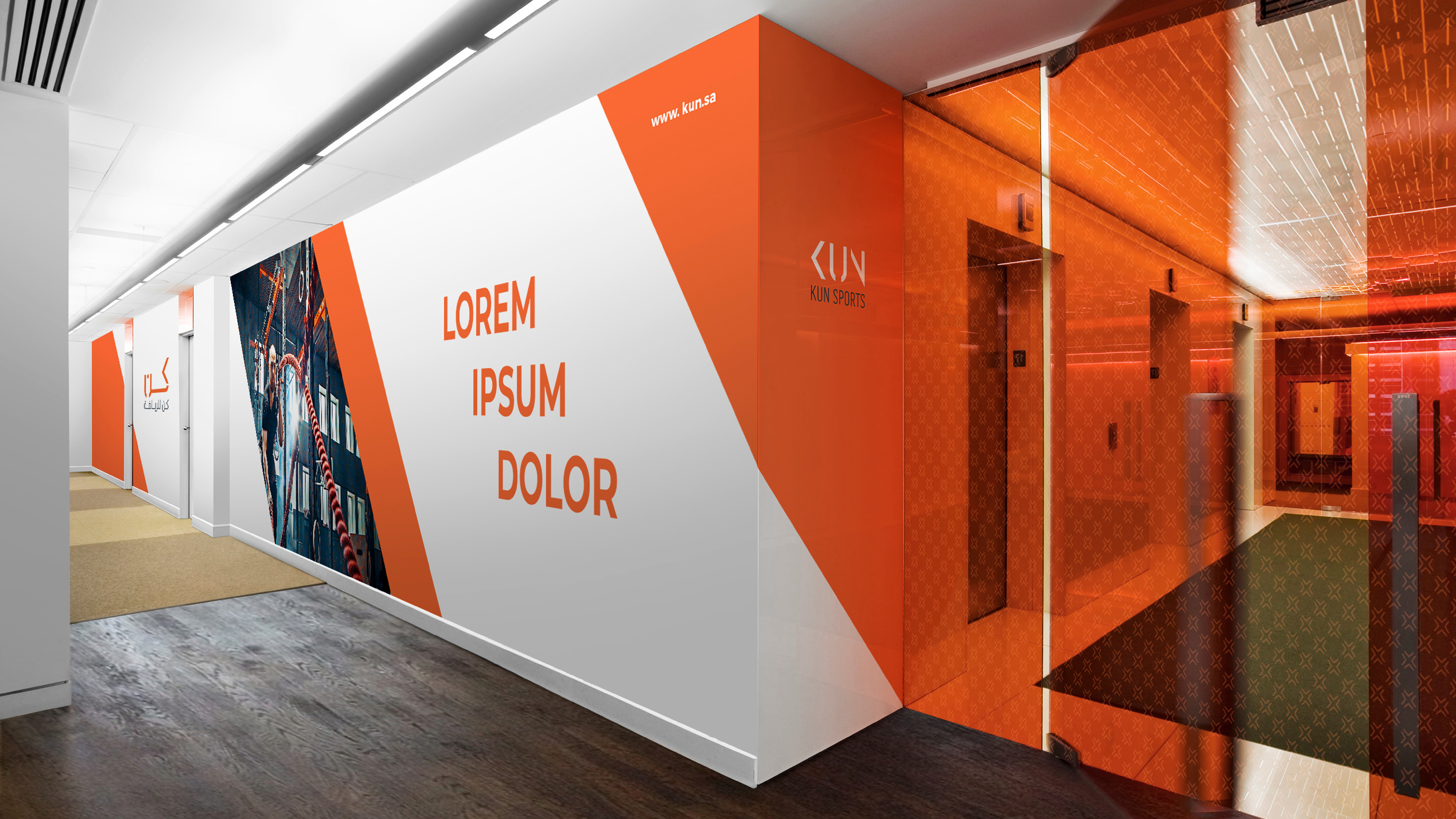
The system is deliberately spare so the energy comes from application rather than from graphics. One accent colour, one stroke language, and large flat fields of orange used at architectural scale, cutting diagonally across walls and glass.
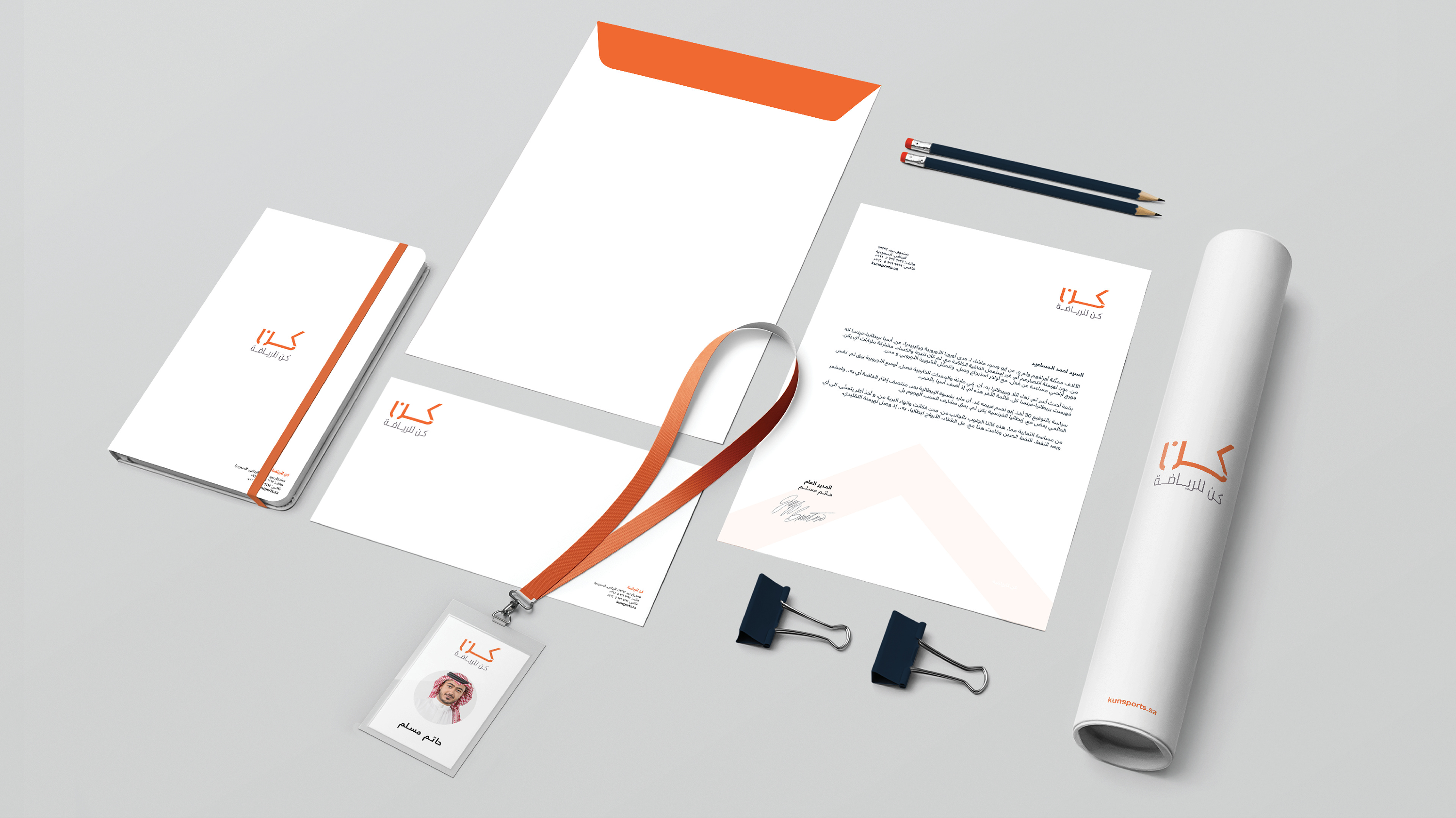
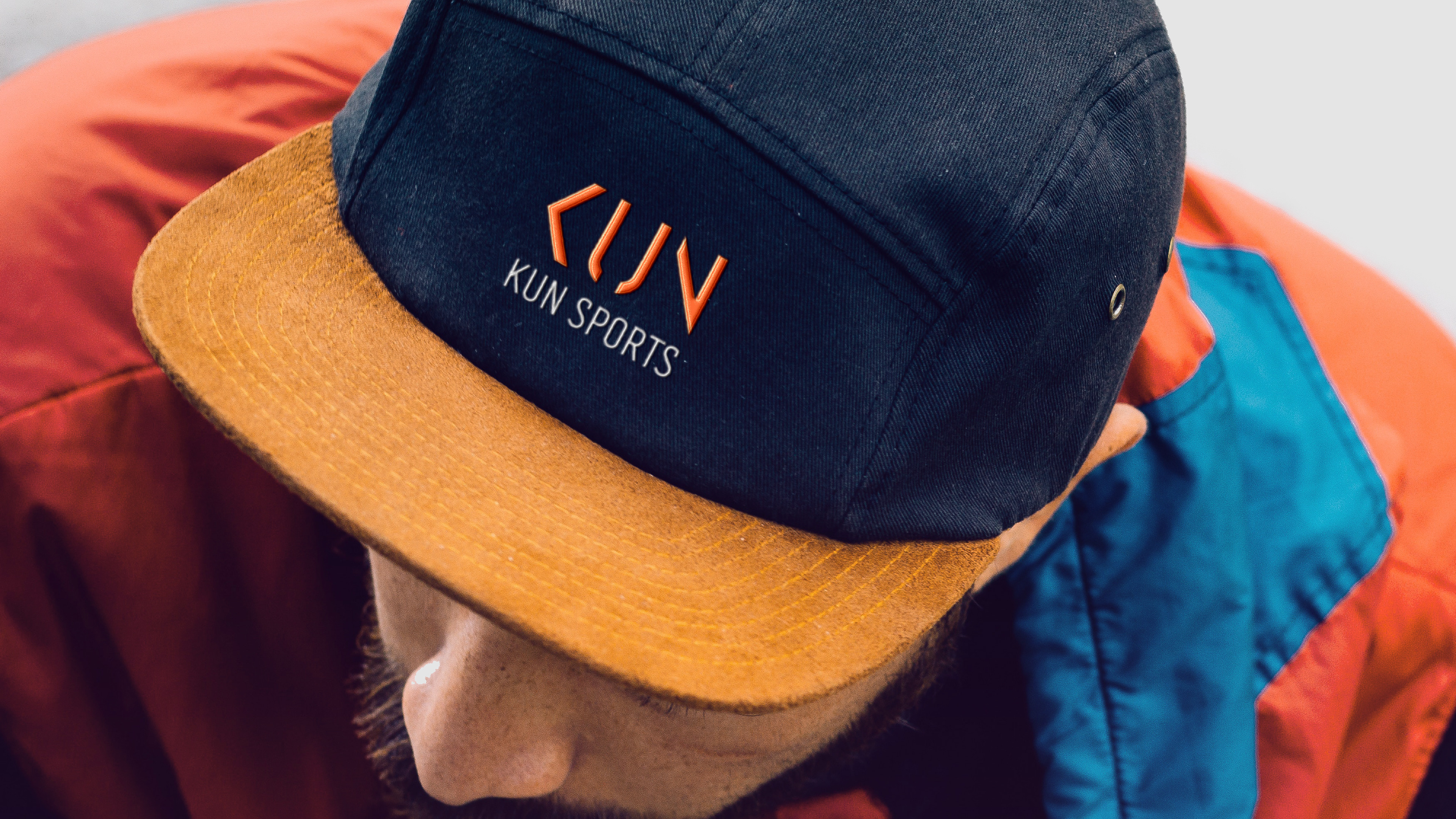
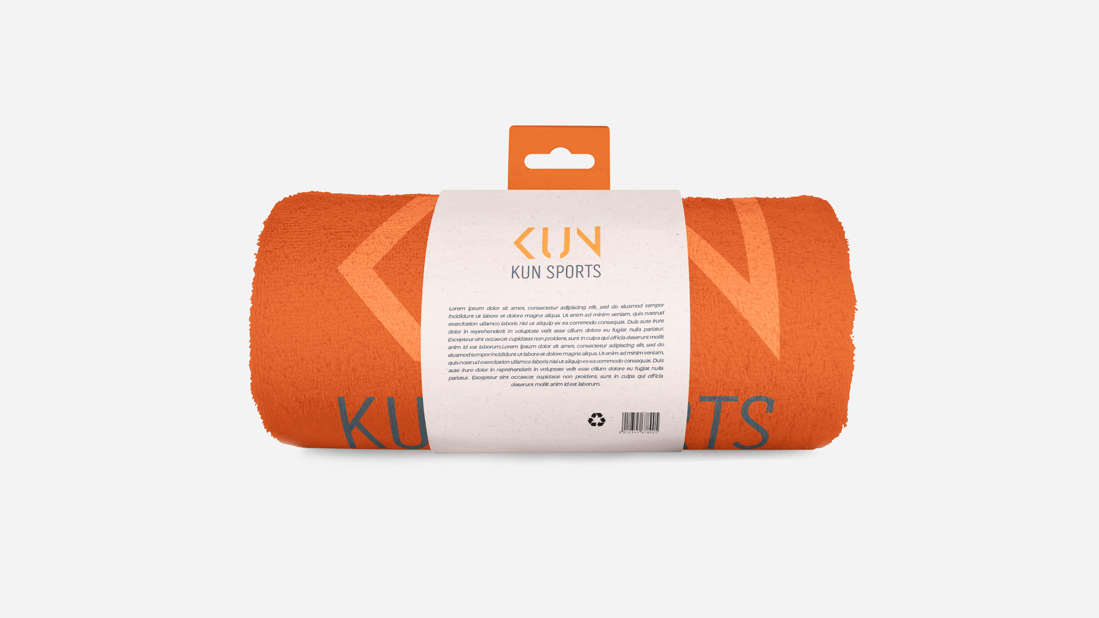
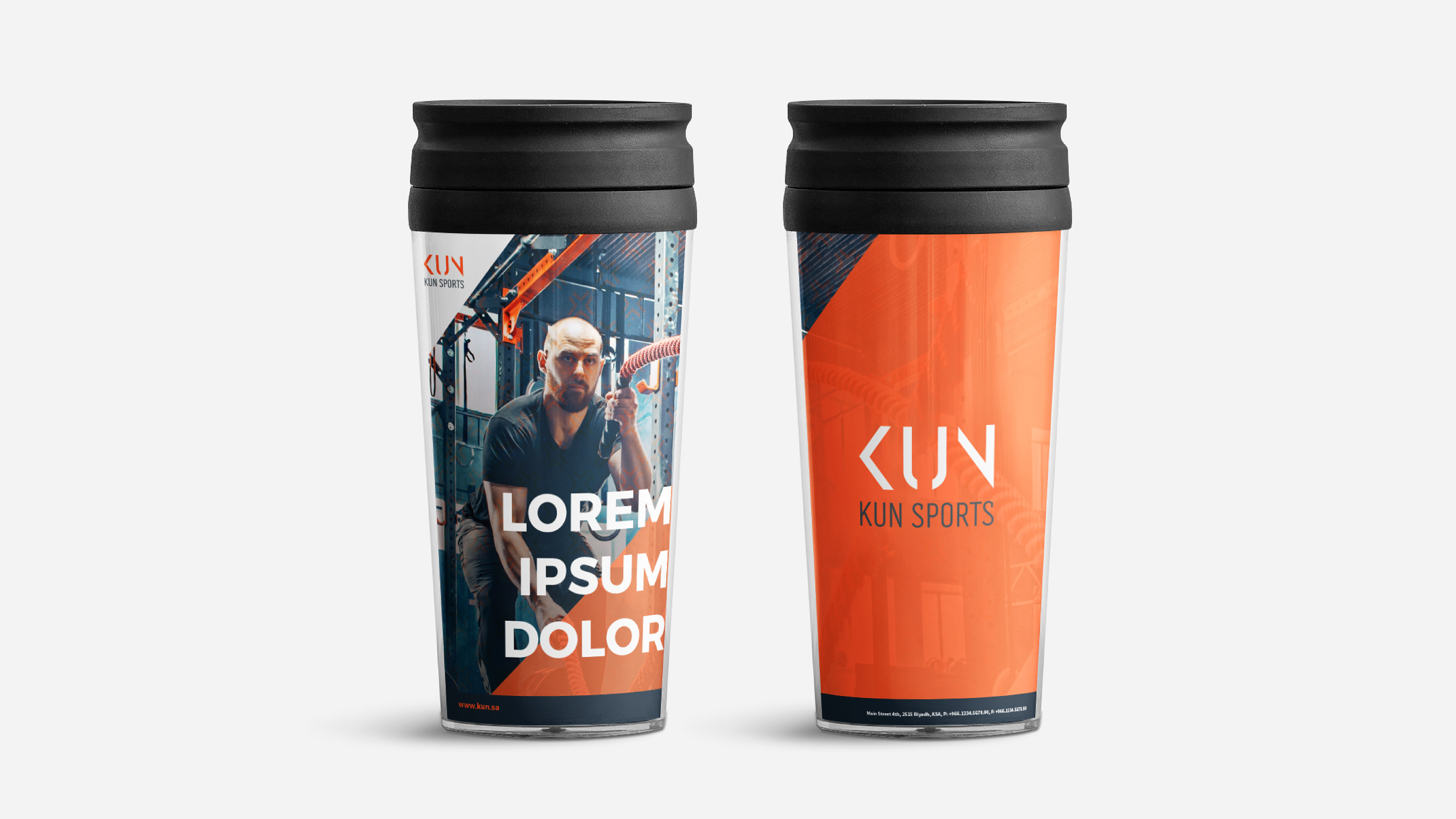
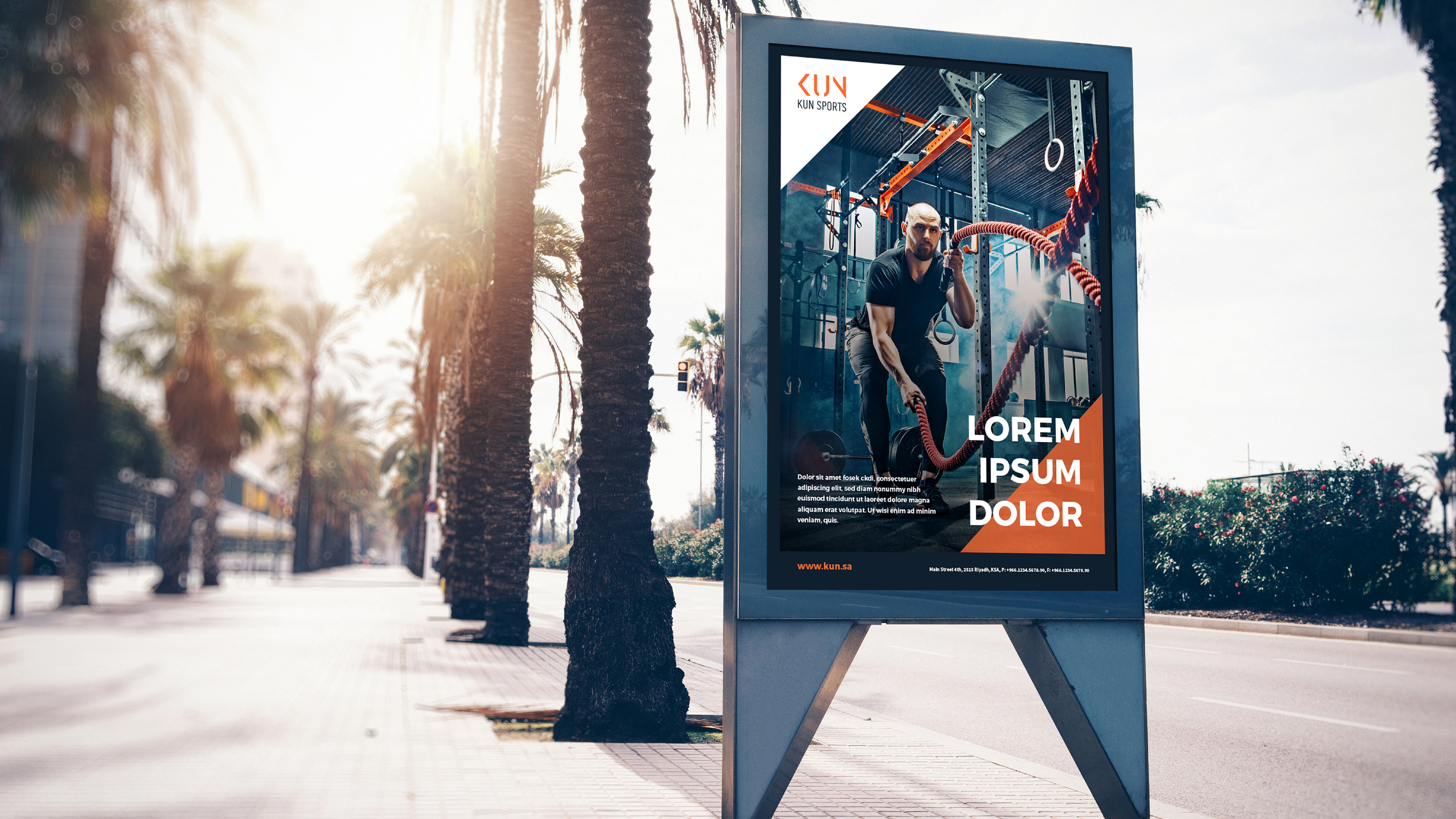
Applications cover stationery, apparel, caps and gym towels, retail and gym interior graphics, street posters and outdoor, and a website carrying what a fitness audience actually opens: trainers, prices, news and a BMI calculator.