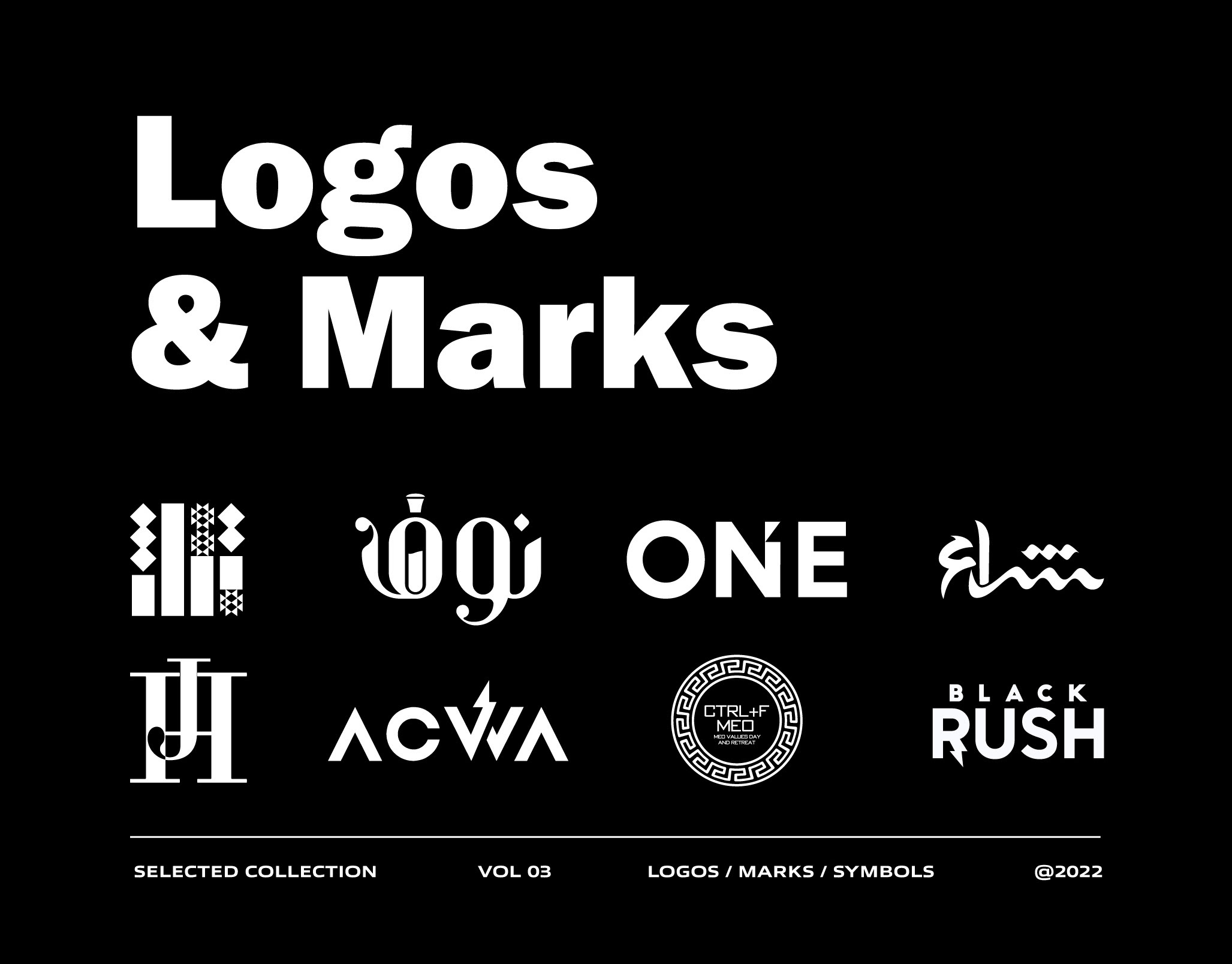
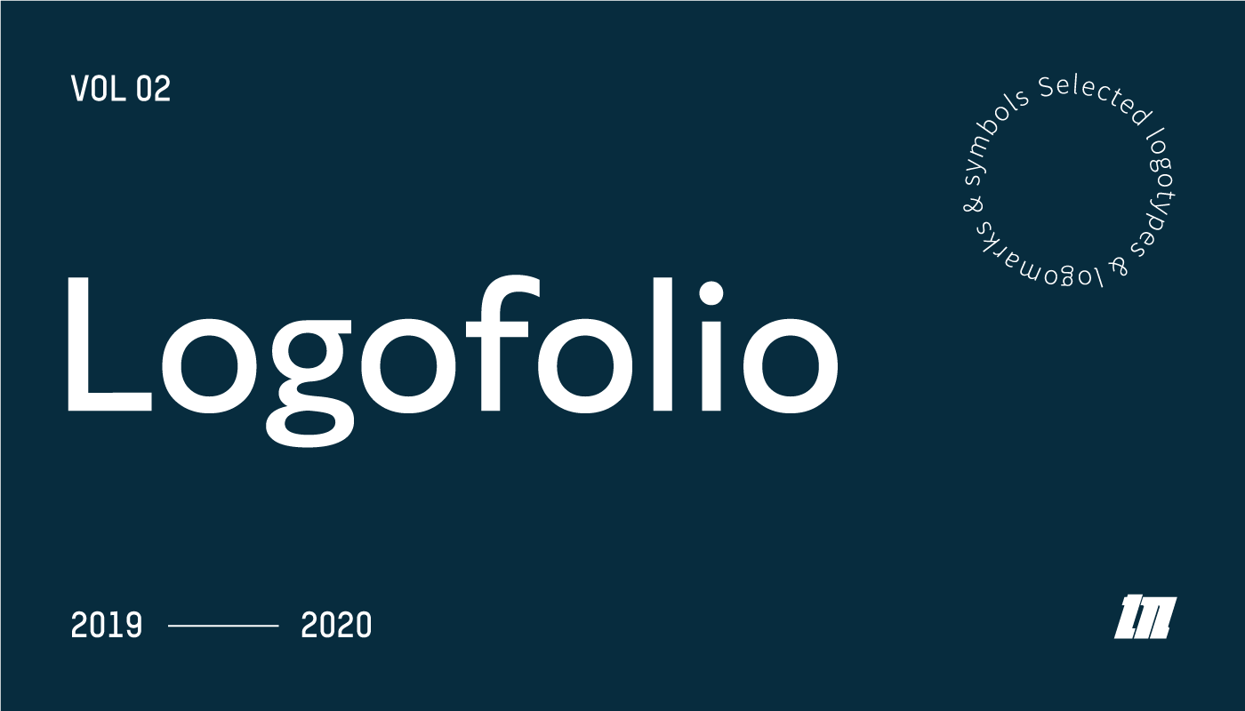
Volume two, drawn between 2019 and 2020. Every mark is presented on its own colour with the category named underneath, because a logo is only judged fairly once you know what it has to do.
The range is the point. Madaline, a fashion label whose mark ends in a spool of thread. Terremoto Coffee, a bean drawn as a cup in a monoline seal. Fly Jordan, an airline logotype where the two halves of the name split by colour. Farha Designs, a compressed display wordmark. Hartland Pizza and Grill, a stone oven with the flame inside it. Miami Men in Nursing, where a heartbeat trace resolves into the letter M. Pooka, a shisha brand whose mark is a phoenix built from smoke.
Alongside them, Arabic marks: Tamkeen, for education, training and consultancy, and Mir'ati for a test bank product, both drawn as Arabic letterforms first rather than as an English mark with Arabic added afterwards.
Retail, property, hospitality, aviation, healthcare, education and consumer, across two languages.