
My own identity. The hardest brief I have ever had, for the obvious reason that there is no client to argue with.
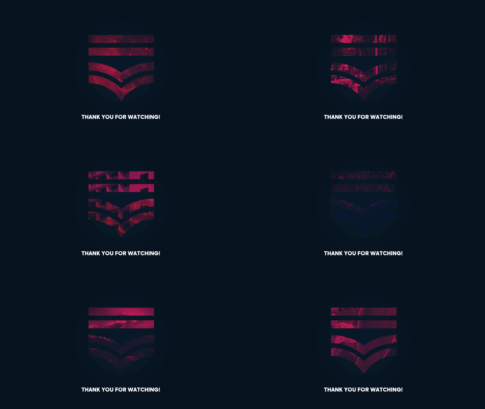
The mark is a monogram split in two. Three straight bars stacked above two chevrons: the bars are Tariq, the chevrons are Msallam. Both halves are drawn on the same circular construction grid, so the geometry that sets the width of the bars is the same geometry that sets the sweep of the chevrons, and the two names are literally built from one figure.
That split is not decoration. Most of my work is bilingual, Arabic and English, and the discipline that makes bilingual identity work is finding the one construction that both scripts can be cut from rather than drawing two logos and hoping they sit together. The personal mark is that principle applied to my own name.
Colour is crimson, e7054f, against a near black navy, 0a1b2d, with a paper grey. Type is Madani Bold throughout, a geometric sans that holds up at small sizes and does not fight the mark. The chevron repeats out into a wave pattern that carries the identity across surfaces where the logo itself would be too loud.
Applied across stationery and business cards, screen wallpapers for desktop, tablet and phone, lanyards and event collateral. It is the mark at the top of every page on this site.